
In this post I take a detailed look at the simulation results for the energy transition model introduced in the previous post, when it is run with the default parameter values—what I referred to last time as the “standard run”.
Before getting started though, this is a good place to reiterate the motivation for undertaking this work. I’m prompted here by a post on John Quiggin’s blog that he provided a link to as a comment on the previous post. The post is a 300 word dismissal of the relevance of energy return on investment in assessing PV electricity supply performance. It was—I assume inadvertently—a timely demonstration of the central point I was making: to have a productive conversation about these issues, we need to take a comprehensive, integrated view. But looking beyond the technical superficiality of John’s argument, he also made the misleading inference that a concern with the energetics of energy transition is the exclusive preserve of “renewable energy critics”.
With this in mind, I’ll state my position as clearly as I can here: an interest in critically assessing the capacity for renewable energy systems to directly substitute for incumbent energy systems should not be conflated with “being opposed to renewable energy”. I myself am a long-time proponent for and supporter of a transition to renewably-powered societies. Having taken the time to be fairly broadly and deeply informed in this area, it is apparent that there are significant uncertainties relating to the forms that such societies might take, especially given the tight coupling between current globally-dominant societal forms, and the characteristics of their primary energy sources. It’s apparent to me that humanity stands a better chance of developing future societies supportive of high life quality if these uncertainties are taken seriously, rather than being discounted or ignored. The question that most interests me here is:
What forms might future renewably-powered societies take, if they are to enable humans and other life forms to live well together?
And following from this, how might we best pursue the process of transition towards such future societies?
Developing a more integrated view of the relationship between societal forms and their enabling energy systems would seem to be of benefit here. I do work in this area primarily because a widespread interest in this is not apparent amongst the communities that currently dominate renewable energy transition discourse and practice. Furthermore, my own inquiry suggests that failing to take a more integrated approach as early as possible could have increasingly adverse consequences as such a transition proceeds.
And with that, it’s back to the primary task of considering what our energy transition model might have to tell us about such matters.
Introduction: the standard run as a plausible future scenario
While the model allows for a wide range of user adjustments, the default settings reflect my own best assessment of what a plausible real-world configuration might look like. That said, the model is not intended as a tool for predicting a concrete future, but as a means of exploring relationships, influences, sensitivities, impacts and consequences. In this sense, it may be most usefully viewed as a scenario generator. It generates a fairly tightly bounded set of scenarios, though, in that the retirement rates for fossil energy sources, and the future contributions of biomass, hydro and nuclear sources are fixed, as is the requirement that the remainder of the supply task be met only by wind and utility-scale PV electricity generation buffered with lithium ion batteries. A further constraint is that the “desired future” is pre-defined as a supply task in which a quantity of final energy services equal to the peak level under the former fossil fuel regime is to be made available.
Once the initial model structure was complete, I held off for a couple of months on making it widely available in order to gain some familiarity with the scenario space that it opens up. During this period, I also made many iterative changes and additions to the model structure, and refined the default parameter values. Despite the very simple view of the global economy that the model presents, the 85 input parameters and almost 1200 feedback loops can produce some surprising behaviour, and so I wanted to get a sense of how well this actually reflected the situation being modelled, rather than simply being an artefact of the model itself. Even so, there is plenty of scope for further exploration.
It’s worth highlighting that the standard run is only intended to depict a plausible future based on typical mainstream assumptions (and hopes) around renewable energy transition, rather than an optimal solution for meeting the supply task. Further detailed documentation is provided as follows:
- The standard run values for the full parameter set (with sources where relevant) is documented here.
- An Excel spreadsheet with calculations for PV emplacement energy and operating & maintenance plowback rate is available here.
Aren’t there other important renewable sources that the model leaves out?
A note of clarification is needed here. The major source omitted from the model is concentrating solar thermal electricity generation (CSP). Other sources such as wave and tidal electricity generation may have significant potential at a local or even regional scale, but make up only a very minor portion of the global technical potential for renewably generated electricity. Including contributions from these minor sources would have little impact on the overall picture presented here. CSP has much greater potential to contribute to overall global energy supply. The EROI for CSP operating in favourable locations (low to mid latitude desert regions) is typically understood to be significantly higher than for PV. It also has a natural advantage in its ability to accommodate short term intermittency with thermal storage. This benefit does come at a significant cost, and even without significant thermal storage, the financial cost of CSP is now considerably higher than for PV. The main reason, though, for omitting CSP here is that the model is designed to specifically explore issues associated with the widely (and popularly) assumed role that battery-buffered PV and wind electricity generation will play in a transition away from fossil energy sources.
CSP has various benefits that make it attractive as a large-scale energy source. Its omission here is not intended as a dismissal of its potential to contribute to a wider supply mix.
Operating life, capacity factor and EROI
For any energy supply system, the total energy return is dependent on the operating life of plant & equipment, and on capacity factor. Extending the operating life increases the energy return. Likewise, increasing capacity factor increases the energy return. The operating life for utility-scale PV plant & equipment in the standard run is 25 years, consistent with typical PV industry assumptions.[1] It is sometimes argued that since there are PV systems in place that have operated for longer than this, the real energy return from PV in general can be expected to exceed the figures in published studies. At the global scale, this is a question of long-term mean field performance, rather than a matter that can be determined on the basis of isolated anecdotal evidence. If it turns out that, with high penetration of PV generation in the global energy supply, mean plant & equipment operating life significantly exceeds 25 years, then this will certainly lead to a more favourable outcome than is suggested by the model’s standard run. On the other hand, PV cell performance degrades with time, and so if longer operating lives are achieved in practice, life time mean capacity factor will also reduce. It is, of course, also possible that mean operating life will be less than 25 years. The important question is how much difference this makes to the overall picture, when an integrated view is taken. The model allows sensitivity to such considerations to be tested. Importantly, the model makes clear that extended operating life has little impact on what happens during the critical transition phase between a fossil-fuel dominated and a renewables-dominated energy supply.
The global annual mean capacity factor for PV is set to 17% for the standard run. This is based on published data for the annual mean value for all PV systems of 12% (see [2] for source), plus an adjustment of 5% to bias the figure towards the higher performance achieved for utility-scale plants compared with rooftop systems. The energy investment basis for PV is based on utility-scale data, which includes inputs not required for rooftop systems, but that results in significantly higher energy returns. In order to ensure that these additional energy inputs are matched with the commensurately higher outputs that they enable (e.g. from use of tracking systems), the reference capacity factor is increased accordingly. The adjustment of 5% is a rough estimate based on inspection of various sources that present field performance data on the high vs mean capacity factor for particular locations (see here for instance).
It is also worth noting that the global annual mean reference capacity factor for PV of 17%, that forms the basis for the parameter value in the standard run, is likely higher than actually achieved in practice. In their study of utility-scale PV in Spain, Prieto and Hall found the real capacity factor to be approximately 77% of the nominal capacity factor, once “downstream” losses between the inverter and plant boundary, along with some other considerations, are taken into account.[1] This adjustment has not been applied to the standard run parameter value, as it is not clear to what extent the Spanish situation is applicable to the global context. Some part of the 23% discrepancy will apply, so the standard run PV capacity factor can be considered optimistic.
Determining an appropriate parameter set for wind was more challenging than for PV. I am not aware of a wind study that is equivalent to Prieto & Hall’s for field performance of PV. Most studies report operating energy plowback rates that are significantly smaller than would be expected based on typical operating & maintenance costs, in the order of (for Europe) 10 €/MWh. This corresponds with an operating & maintenance energy plowback rate of approximately 2% of gross output. When wind-relevant factors equivalent to those included by Prieto & Hall for PV in Spain are also taken into account, it seems plausible that this might double. For emplacement energy, Crawford reports a value equivalent to expending around 0.270 GW for a period of one year to emplace each 1 GW of nameplate capacity.[3] Again though, this value appears to be lower than would be obtained from a field study of operating installations.
With all this in mind, the approach that I have adopted is to start with data that is field-based, but that is now quite dated and for which the overall energy investment is clearly much higher than would now be the case.[4],[5] I have then applied adjustment factors to the starting values for emplacement energy and operating & maintenance plowback, so that the overall EROI converges in the range 13-15:1 under steady-state conditions—that is, when capacity emplacement and retirement are in balance, and overall output is roughly constant over time.
![Figure 1: Global annual land constrained gross wind energy output distributed by EROI. Adapted from [3], p. 247, Fig.1, land constrained case.](https://beyondthisbriefanomaly.org/wp-content/uploads/2015/08/fig-1-global-wind-energy-distribution-by-er.png)
Figure 1: Global annual land constrained gross wind energy output distributed by EROI. Adapted from [6], p. 247, Fig.1, land constrained case.
The case for assuming a constant global mean EROI from the outset, rather than working from the top end of the range downwards, perhaps warrants some further discussion. This is supported by the observation that wind potential is not exploited from the best sites downwards, but rather sites across a spectrum of quality are developed simultaneously. This is demonstrated by the fact that the global mean capacity factor for wind is around 25%, whereas optimal sites have capacity factors over 40%. Political considerations come into play here. If global wind development was guided by purely technical considerations, then a “best sites first” pattern might well prevail. Real-world development, however, proceeds according to priorities at the nation-state level. So, for instance, one nation might pursue a rapid development program even if its own wind resources are of relatively modest quality, whereas another nation may have policies less favourable to wind development, despite having superior wind resources. For this reason, developments in turbine technology have only restricted scope to increase overall wind potential. Capacity factor, and hence EROI, is a function of turbine siting plus technology, rather than technology alone.
The original source for the baseline wind energy investment parameter values used in the standard run gives a wind turbine operating life of 30 years. This is much longer than the 20 year life typically assumed in more recent studies.[7] The standard run uses 20 years. Overall though, I’ve attempted to apply a “realistically optimistic” bias to the wind parameter values.
I will continue the capacity factor discussion in the next section, as there are critical inter-relationships with storage capacity.
How much battery storage should be included?
This is not a simple matter. The standard run is based on 72 hours autonomy for wind and 154 hours for PV electricity. The appropriate values for these parameters are subject to a high degree of uncertainty. That said, in electricity supply systems dominated by intermittent sources, and with very modest levels of dispatchable capacity, we can say with a fair degree of confidence that the values should fall in the range of days to weeks, rather than hours.
The common purpose of battery buffering for wind and PV is to intermediate generation that is uncontrollably variable, and demand that varies both diurnally and seasonally. Beyond this, sizing for each source is subject to significantly different considerations, so I’ll consider each separately.
Wind generation buffering
Superficially, it may seem that the wind-related storage capacity should be sized based on the longest continuous period for which it is anticipated that generation will fall below mean demand for that specific period (that is, taking into account seasonal variation around annual mean demand). Indeed, this is the basis for characterising sizing in terms of an “autonomy period”. However, if wind capacity is sized, using an annual mean capacity factor, to meet annual mean demand (as is the case here), then there is no flexibility. Every unit of generation that exceeds demand at that instant must be stored, in order to fill a corresponding gap when instantaneous demand exceeds generation. This means that storage capacity must be available to accept the excess generation whenever it occurs, regardless of how much energy is already stored.
In other words, having enough storage capacity to cover the longest low wind period is not a sufficient design criterion on its own. Storage capacity must also be sized to store the entire, cumulative excess from every high wind period, regardless of the sequencing and magnitude of high and low wind periods. If the storage level reaches capacity during a windy period, generation must be curtailed, and that energy is lost. If the stored energy is exhausted during a calm period, demand must be curtailed (blackouts), and hence reliability degrades. The design challenge is exacerbated when periods of significant excursion from long term mean generation and demand patterns is taken into account.
This can be addressed to some degree by one of two methods. The generating capacity can be increased (lowering the effective capacity factor), so that opportunity to store energy increases, with a corresponding increase in curtailed generation. Or storage capacity can be increased to a level that allows all excess generation to be stored, regardless of when it occurs. The financial advantage of increasing generating capacity over increasing storage is most likely the determining factor in which option would be favoured in practice. For the purpose of the standard run, I will ignore this issue and leave the initial capacity factor at the current global mean value of 25%. Sensitivity to this can be tested simply by de-rating the input value.
The global mean autonomy period of 72 hours should also be regarded as optimistically low, given the documented regular occurrence of calm weather significantly exceeding this duration. Integrating generation, storage and demand over large geographic areas may offset to some degree the vulnerability implied here, provided peaks and troughs in each cancel one another out to a sufficient extent. This suggests that inter-connection of widely-dispersed generating regions would be required, and grid distribution of electricity would continue to be essential for finding a viable cost versus reliability trade-off, even with significant levels of storage. I will look at this further in discussing PV buffering.
PV generation buffering
In addition to cloud cover-related intermittency, PV is subject to uncontrollable variation due to the diurnal and annual insolation patterns. From a storage perspective, the effects of intermittent cloud cover and the annual cycle between the summer insolation maximum and the winter minimum will dominate requirements. If these are addressed, then the diurnal variation will be accommodated, and so this doesn’t need specific attention here.
Seasonal variation means that, for a system sized to meet a constant annual mean demand rate, generating capacity will be in surplus for part of the year, and in deficit for the remainder of the year. To balance supply and demand using storage alone, sufficient capacity would be needed to store the full summer surplus. The size of the summer surplus increases non-linearly from the equator towards the poles. Storage capacities required to accommodate the difference between summer surplus and winter deficit at a number of latitudes are shown in Table 1, based on data published here. This makes fairly apparent that storage, other than at the equator, does not provide a viable means to accommodate summer-winter variation.
A second option is to optimise panel orientation for winter generation, and increase installed capacity so that mid-winter generation matches mean daily winter demand. The supply capacity will then be oversized for the rest of the year, during which time output will need to be curtailed. This entails a reduction in the effective capacity factor, with the curtailed proportion of output increasing non-linearly from equator towards poles, as shown in Table 1. Note that the effective capacity factors shown in the table are based on matching winter generation to annual mean demand. At high latitudes, winter demand is typically much higher than summer, and so these figures significantly understate the amount of curtailment. Nonetheless, the figures again make clear that this strategy is very unlikely to allow PV generation alone to meet demand on a year-round basis, beyond mid-latitudes around 40o.
At lower latitudes though, this does appear to be a plausible approach, and so the model now includes a parameter adjusting the PV capacity factor to bias towards winter generation. What value should this parameter be set to? Given the proportion of global population in the 20o-40o latitude band, in the standard run I’ve simply split the difference and set this to 0.71. Sensitivity to this parameter can readily be tested.
| Latitude | Days (hours) storage required to accommodate summer-winter variation | Capacity factor based on matching annual mean generation and demand so that no curtailment is required | Capacity factor based on matching winter minimum output to constant annual mean demand (excess generation curtailed). | Winter to mean capacity factor ratio |
| 0o | 3.5 (84) | 15% | 14.1% (5%) | 0.94 |
| 20oN | 20.8 (500) | 17% | 13.9% (10%) | 0.82 |
| 40oN | 49.3 (1183) | 16% | 9.6% (33%) | 0.60 |
| 50oN | 4.5% (57%) | |||
| 60oN | 111.1 (2666) | 10% | 0.7% (92%) | 0.07 |
Table 1: Variation of PV-related performance with latitude. Adapted from [8] and
[9]. Capacity factors are based on field data and account for cloud cover.
This discussion highlights the potential benefits available by providing north-south inter-connection between PV generation sites and demand centres. If inter-connection were to be provided between northern and southern hemispheres, there may even be potential to better match peak summer generation with peak winter demand—though the distances involved are extreme compared with current practice. Again though, contrary to the currently highly-touted and apparently fast approaching off-grid revolution, it seems that least-cost reliability for maximised renewable supply could very well require expanding electricity grids and supra-regional inter-connection.
With summer-winter variation addressed via increased generating capacity rather than storage, the scale of the PV-related storage task is reduced to dealing with overcast periods. With current off-grid PV systems, this is usually achieved with a moderate amount of battery storage, and a diesel generator for less frequent periods of prolonged cloudy weather beyond what the batteries can cover. While the inclusion of biomass, hydro and nuclear generation in the supply mix provides some flexibility here, in the model their contributions are allocated to meeting existing demand. Assuming a role for these sources in covering for PV (or wind, for that matter) supply shortfalls would require a commensurate reduction in the overall demand that could be met reliably. This, along with reduced expectations of supply reliability, would be a legitimate way of reducing storage needs.
But if we set as our design basis that PV must meet the expected demand level with reliability equivalent to what is currently available from dispatchable sources, then battery storage capacity must be large enough to cover even infrequent periods of prolonged cloud cover. In the standard run, this is set at a global mean value of 154 hours autonomy, or 7 days annual mean output. While this may seem high, long term weather records indicate relatively frequent occurrence of events where this would be locally insufficient. It seems reasonable to ask, though, whether the value needs to be this high as a global mean, particularly when storage is integrated into grids covering large geographic areas. This seems to be, at best, uncertain. If it is higher than necessary, this is offset—to some degree at least—by the omission from the model of energy costs associated with expanding electricity grid infrastructure in preference to increasing storage.
We are now set to take a detailed look at the simulation results.
Simulation results: commentary and implications
Figure 2 below presents the overall transition trajectory for the global economy’s energy sub-system, and for the “rest of the economy” that it enables. (Click on figures to open in full screen view). There are three key features depicted in the chart that I’ll focus on.
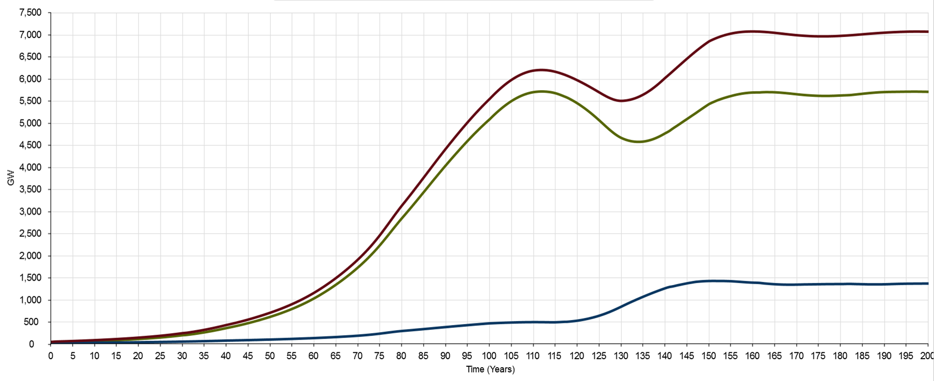
Figure 2: Total final energy services (energy sector in blue, “rest of economy” in green, and total in red)
First, it will be immediately apparent that the model’s central design feature, whereby wind & PV are required to match the peak in energy services just prior to the fossil fuel decline commencing at year 110, has its own fundamental economic implications. The model assumes essentially zero growth in net energy services after that point. Is this an artificial constraint? This depends on the rates of wind & PV generation capacity that can be realised in practice. I’ll discuss this further as we proceed. But the second prominent feature depicted in the chart shows why this isn’t a limiting factor during the crucial transition phase from global energy supply dominated by fossil fuels, to supply dominated by renewables. Here the focus is on the dip in the green and red lines between years 110 and 160, with gross energy services and energy services out to the “rest of the economy” hitting minima around years 130 and 134 respectively. Under the parameter values in the standard run, rapidly growing wind and PV capacity is unable to keep up with the built-in decline rate for fossil sources. The decline rate sees fossil sources reduced to 50% of their peak (energy service basis) by year 140, and all but phased out by year 170 (see figure 4). Energy services to the “rest of the economy” decline by around 20% from peak to trough, while the decline in gross energy services is around 11%.
The severity and timing of the energy services minimum is a function of the standard run parameters, specifically the values for proportional, integral and derivative gain, the combined wind & PV emplacement rate cap, and the proportion of that cap allocated to each source (i.e., the relative contributions that wind & PV make to overall supply). The size and duration of the dip can be reduced by manipulating these parameters. But in doing so, the rates at which wind & PV emplacement grows, and their maximum values, must increase.
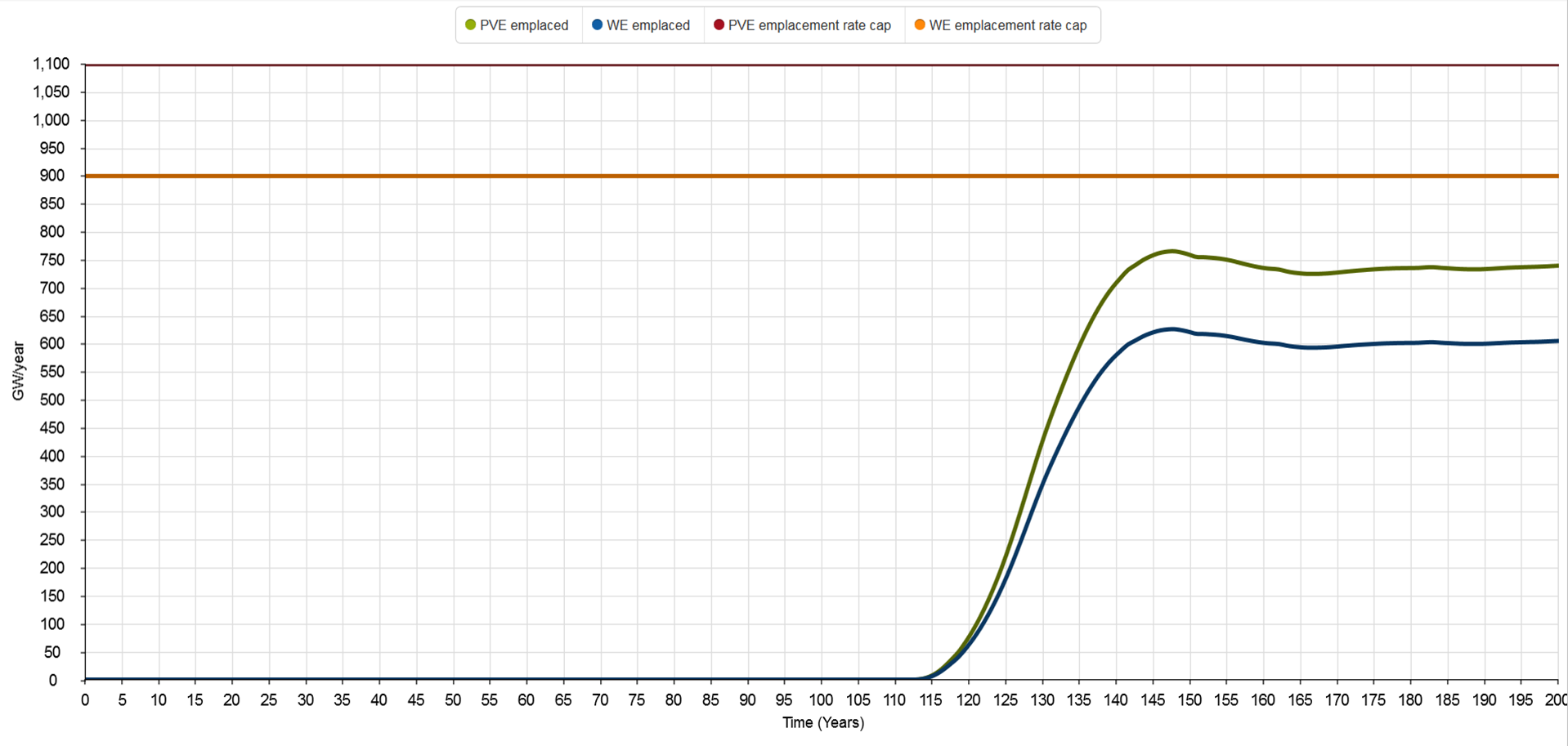
Figure 3: Wind (blue) and PV (green) electricity generation nameplate capacity emplaced annually
Nameplate capacity emplaced annually is shown in figure 3. Emplacement of wind & PV starts in year 113, and by year 120, the emplacement rates are 64 and 78 GW/year respectively. That is significantly more than the current global wind & PV emplacement rates of around 50 and 55 GW/year. So this would imply a doubling of the current global emplacement rates by mid-2020, if the fossil fuel phase-out commenced today, in 2015. For PV at least, this is well within currently forecast estimates, and doesn’t seem to present a particular obstacle.
But by the time we hit the gross energy services minimum at year 130, emplacement rates for wind & PV are 430 and 350 GW/year respectively. They then hit peaks of around 760 and 625 GW/year at year 150, before dropping back a little to maintain the more-or-less steady-state plateau out to year 200.

Figure 4: Cumulative wind (blue) and PV (green) electricity generation capacity
Figure 4 shows the cumulative nameplate generation capacities produced by the standard run. Wind peaks at a bit over 12 TW around year 162; PV peaks later, at close to 19 TW around year 166. For reference, global installed capacities were approximately 370 GW for wind in 2014, and approximately 233 GW for PV projected for 2015. Comparing the figures, we have to ask: how likely is it that wind & PV capacity growth rates of this magnitude could be achieved, and then maintained for so long?
In thinking about this, we need to keep in mind also that we’re talking about a global economy in which the energy services available—work and heat—are in decline. The growth rates required to provide the eventual recovery in energy services occur in the context of overall contraction in the amount of work and heat available to the physical economy.
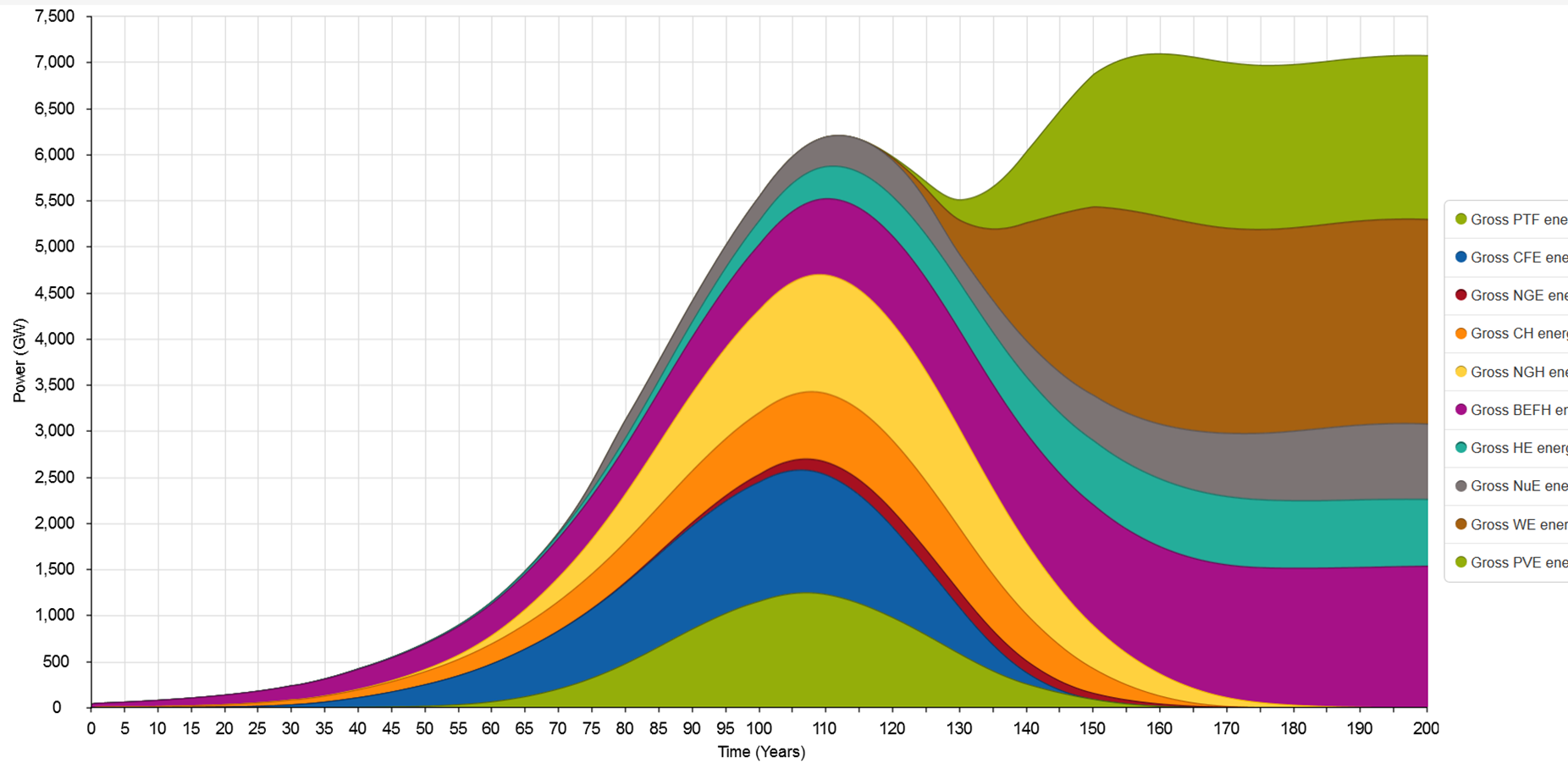
Figure 5: Gross energy services by source
This is after taking into account improvements in conversion efficiency from energy to energy services—illustrated by comparing figure 5 (gross energy services output) with figure 6 (gross power output). As the comparison shows, the relative decline in gross energy services during the transition trough is significantly less than for gross power output. The energy transition involves a net reduction in the final energy output required to meet the expected level of energy services (heat and work). The demand expectation set by the model is effectively stacked in favour of the renewable sources, to the extent that the form in which they supply energy—electricity—reduces the overall scale of the transition task.
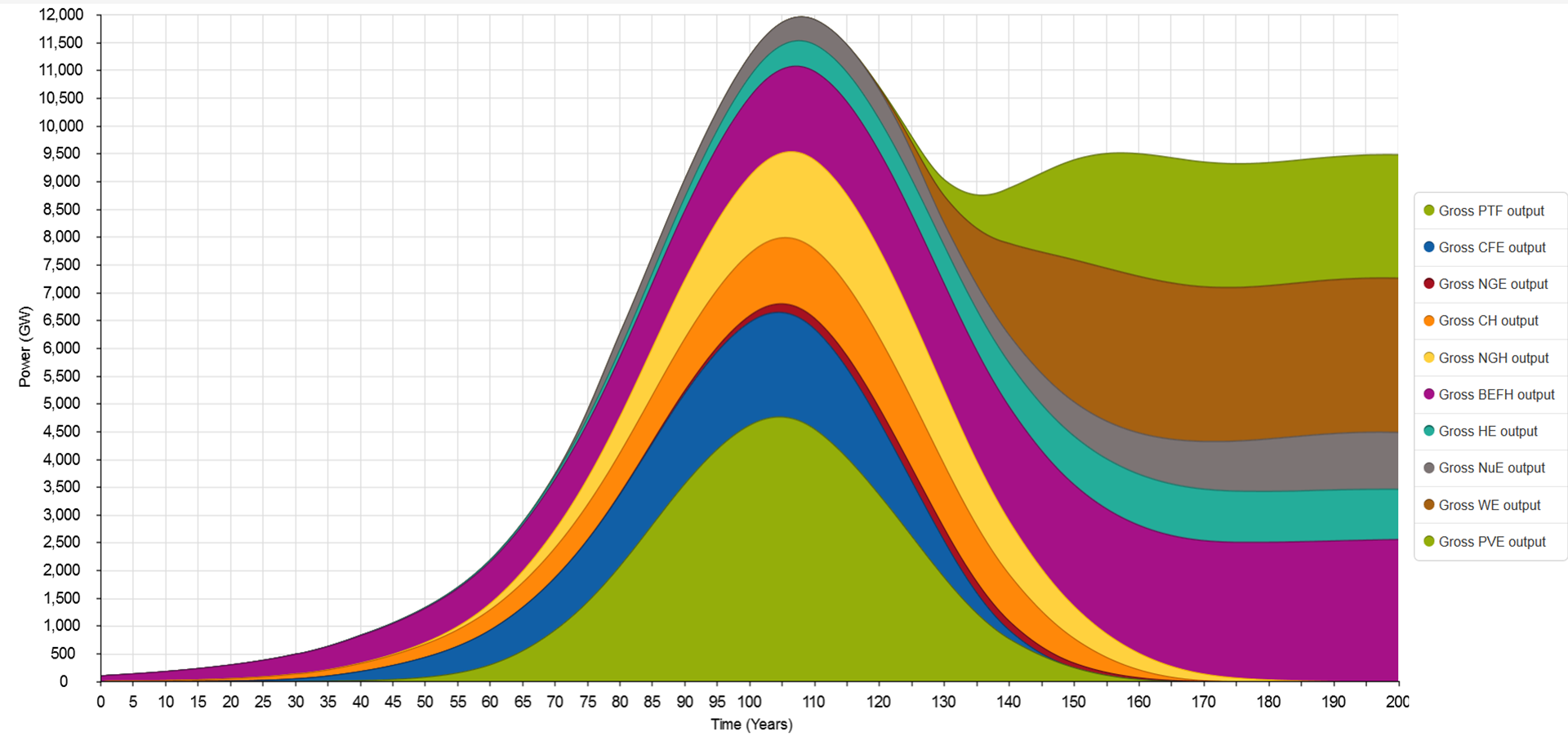
Figure 6: Gross power output by source
What implications might declining energy services have for the global economy’s ability to support high wind & PV growth rates? The smooth functioning of the global economy currently depends on growth in GDP. Can this growth be maintained while net work and heat available are declining as indicated? This would require an unprecedented decoupling between GDP and energy services. Increasing aggregate production, measured in monetary terms, would need to be achieved with less and less physical input, not just per unit of output, but overall. Historical data suggests this is unlikely.
To fully appreciate what is happening during the decline phase, a fundamental distinction between the incumbent energy sources on one hand, and wind & PV on the other, needs to be taken into account. This relates to the time distribution of energy inputs across an energy source’s lifecycle. For an energy source with relatively high emplacement energy, a larger proportion of overall energy investment is required prior to deriving any return. The overall effect of this is dependent on the emplacement rate. Increasing the emplacement rate reduces the rate of increase in net energy return. Figures 7 and 8 illustrate this effect.
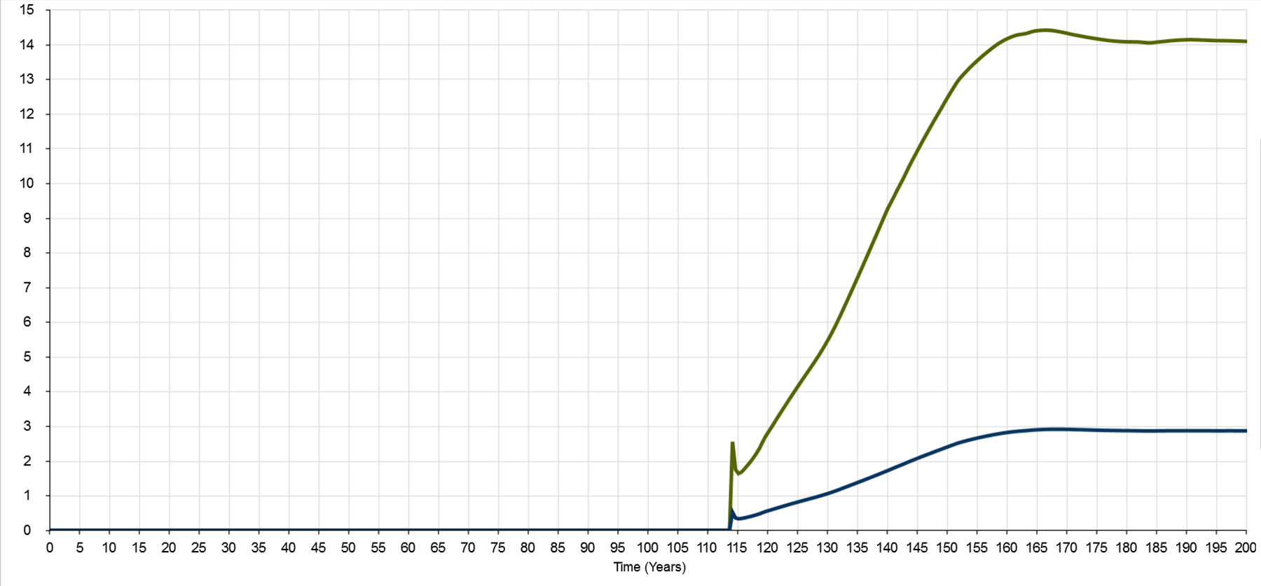
Figure 7: EROI for wind (green) and PV (blue)
Figure 7 shows how EROI for wind & PV varies over time, starting from effectively zero, and reaching the nominally anticipated level only when net growth in capacity stops. A single, lifecycle value of EROI is inadequate for understanding the contribution that an energy source can make under a rapid transition scenario, as I’ve discussed previously here.
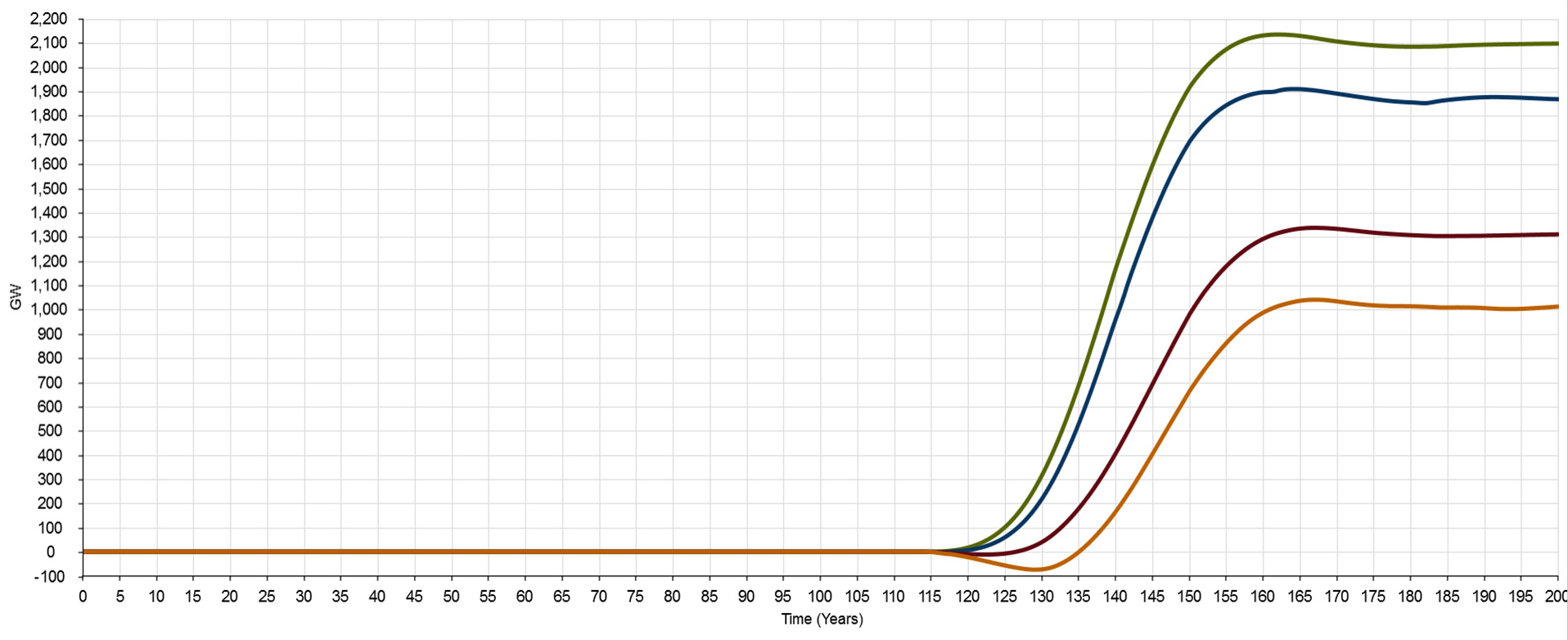
Figure 8: Net energy services delivered by wind (green: unbuffered; blue:buffered) and PV (red: unbuffered; orange: buffered) electricity generation
Figure 8 shows the net energy services provided by wind & PV, with and without battery buffering. Even without battery buffering, PV makes no net contribution until after year 125. Adding battery buffering makes the situation worse. In fact, under the standard run scenario, PV with battery buffering makes a net negative contribution to total energy services up to year 135. That is, installing PV generation and battery buffering capacity takes energy services away from the rest of the economy for the first 22 years of the transition. Wind, buffered or unbuffered, performs better but is still only slightly net positive at year 120. This is a situation that I’ve discussed elsewhere, and that Tom Murphy calls The Energy Trap.
Might it be, though, that this situation is simply due to insufficient effort? Setting aside for the moment the question of whether the standard run emplacement rates are practically achievable, why don’t we just go all out and shoot the moon? Crash through or crash out. Surely if we get really ambitious, and push the emplacement rates way up, this problem just goes away. It’s just a matter of getting the rate beyond the threshold that’s holding us back, right?
Well, in a word, wrong. Increasing the combined rate of wind & PV growth makes the situation worse, not better. It’s situations like this where the system dynamics modelling technique comes into its own. Figures 9, 10 and 11 show an extreme emplacement rate scenario.
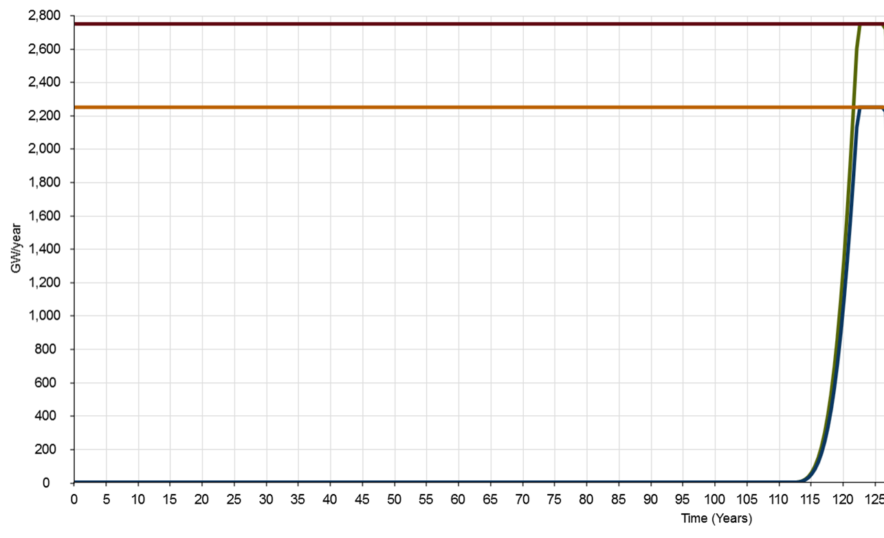
Figure 9: Wind (blue) and PV (green) electricity generation nameplate capacity emplaced annually under extreme emplacement rate scenario
I’ve pushed the combined wind & PV emplacement rate cap right up to the model’s maximum range value of 5000 GW/year, and increased the proportional gain on the emplacement rate controller from 1, right up to the model’s maximum value of 10. Figure 9 gives the emplacement rates: around 600 GW/year each for wind & PV by year 118, reaching full range caps of 2200 and 2800 GW/year respectively by year 123. This is seriously moving. So what happens?
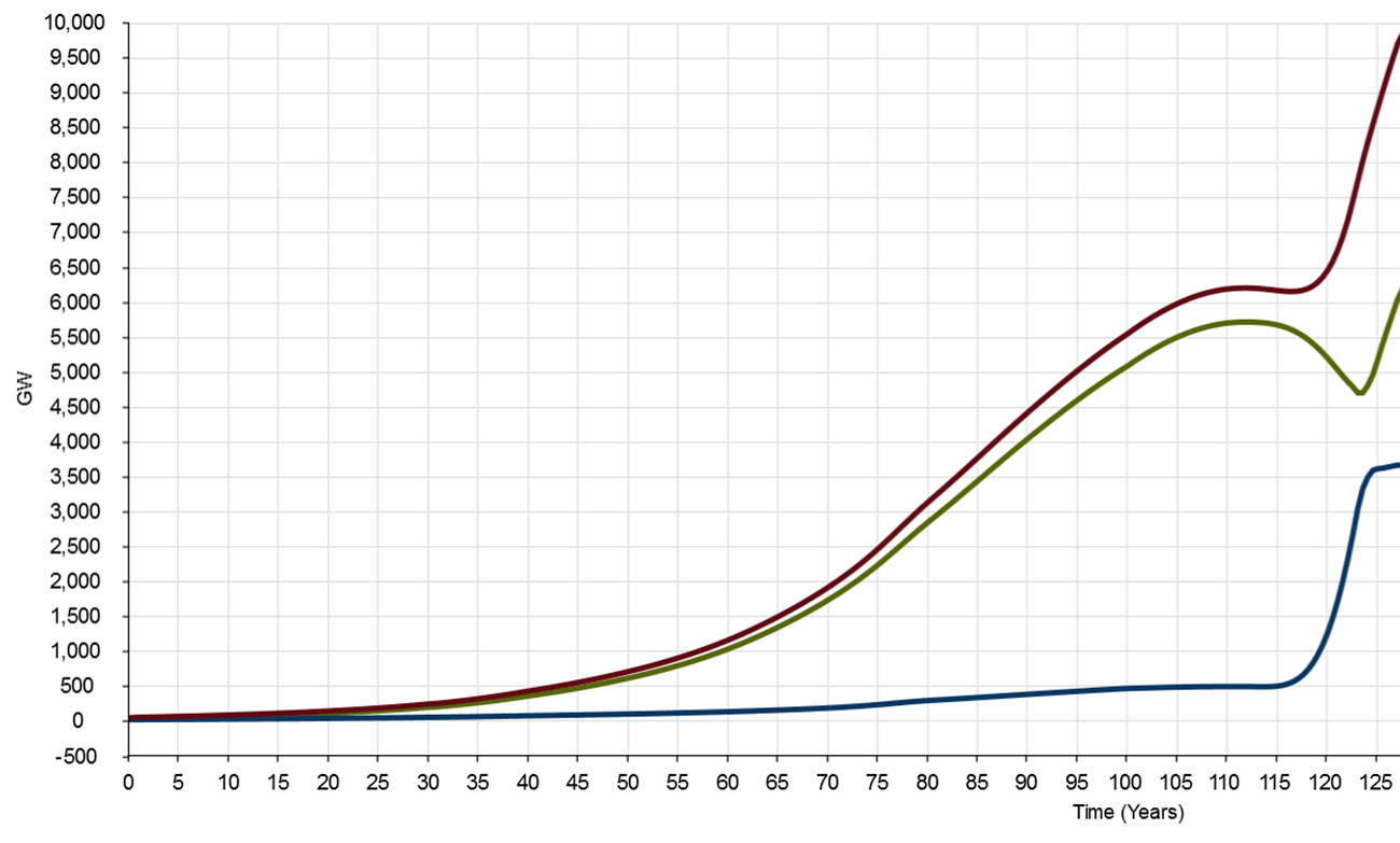
Figure 10: Total final energy services under extreme emplacement rate scenario
As figure 10 shows, from the point of view of the “rest of the economy”, very little—other than to bring forward the bottom of the energy services trough by around a decade. That is, decline in the energy services available accelerates greatly (although the decline in energy services available is about 100 GW less in this scenario). Meanwhile though, the size of the energy sector (the blue line in figures 2 and 10) grows to more than twice its standard run peak, reaching a level more than 75% that of the rest of the economy (up from around 9% just prior to the start of the transition).

Figure 11: Net energy services delivered by wind and PV (buffered and unbuffered) under extreme emplacement rate scenario
If we look at figure 11 though, there’s some important nuance in the details. Wind, which was previously having little net effect on energy services available to the economy at year 120, is now making a modest contribution. But by year 125, that contribution has increased from less than 100 GW to 1600 GW. PV, on the other hand, has taken off in the opposite direction. It reaches a net negative drain on the economy of 1000 GW around year 123, and doesn’t return to surplus until about year 128. Excluding buffering, the maximum net negative drain is around 375 GW at year 123, returning to surplus at year 125. So the deficit is not simply driven by the quantity of storage, it’s an inherent feature of the high up-front energy inputs required for PV generation, when these are accounted for comprehensively.
We touched above on the third important feature in figure 2 that I want to highlight: the change in the size of the energy sector (measured in terms of the combined work & heat it requires), relative to the rest of the economy. As the blue line in figure 2 shows, the transitional energy sector peaks at almost three times its pre-transition size, before settling back slightly under steady-state (no growth) conditions, post transition.
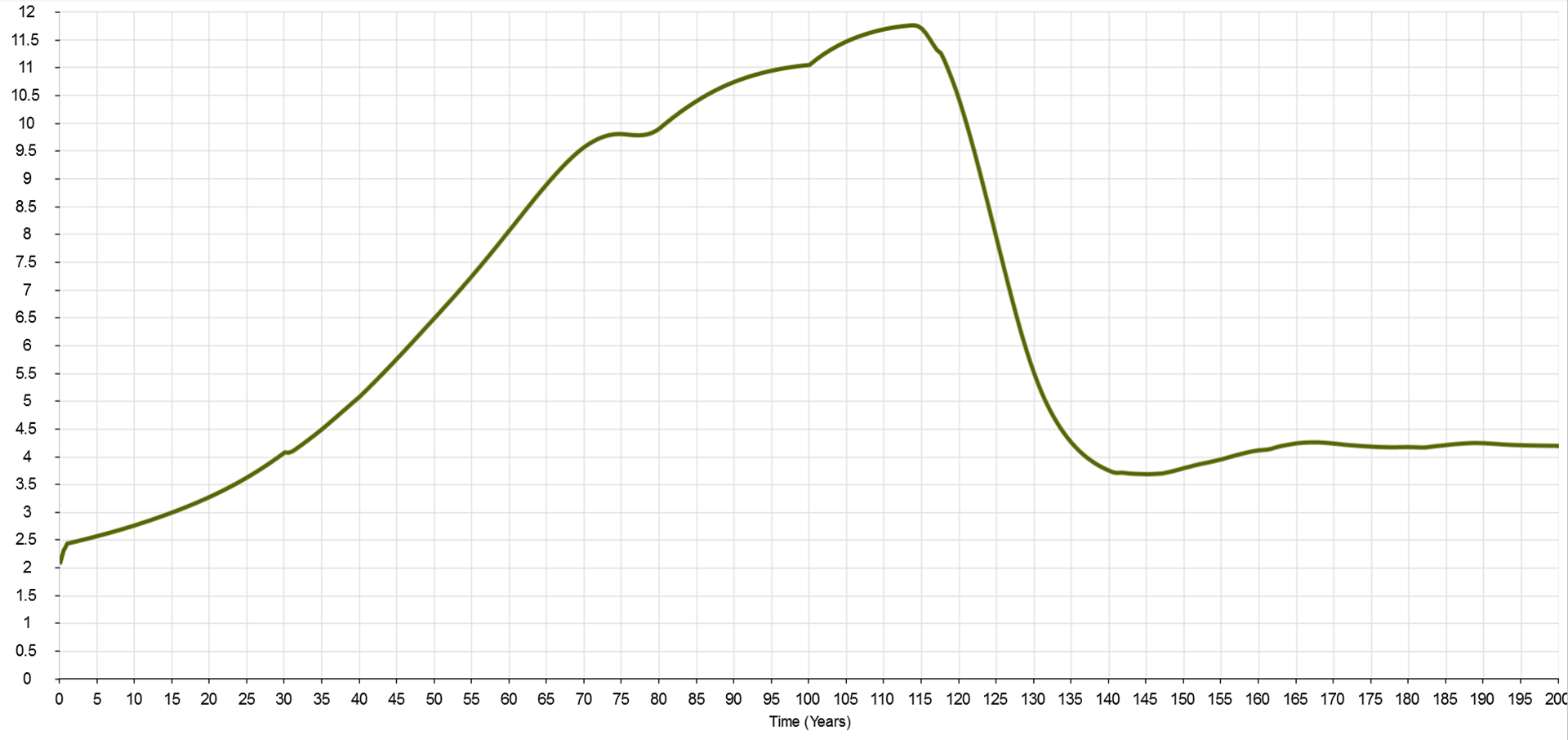
Figure 12: Energy services ratio
The relationship between the sizes of the energy sector and the rest of the economy is depicted in figure 12, via the energy services ratio. This is calculated by dividing net energy services made available to the rest of the economy, by the energy services that the energy sector uses. Pre-transition, the ratio peaks at around 11.6. Once the transition commences, it drops precipitously, bottoming out at approximately 3.7 around year 140. The key takeaway here is that, under the standard run scenario, in a global physical economy for which wind & PV play such significant energy supply roles, the energy sector must grow several times over both in actual size, and as a proportion of overall activity (measured in terms of energy services used). We see here a thumbnail sketch of a global economy in which activity directly related to energy supply requires a greatly expanded proportion of available resources, and hence constrains non-energy supply related activity. This is very significant, when we consider current expectations for future economic development. Not only does it imply an increasing redirection of resources toward energy supply, but also the potential drawing awa of capacity from addressing other development priorities.
It’s also worth pointing out here that the standard run may very well down-play the nature of the transition task. As figure 13 shows, this involves a massive shift in final energy from liquid, gaseous and solid fuels towards electricity.

Figure 13: Total gross power output (fuels and electricity), with total electricity only shown separately
Pre-transition, electricity accounts for around 25% of final energy. Once the dust has settled post-transition, it is over 70%, and this excludes electricity from the biomass component. This implies a commensurately large (and rapid) roll-over in the global stock of energy converters—plant & equipment, and other devices, used to convert final energy into useful services. The most prominent consumer-level example at the moment is probably the anticipated shift from petroleum-fuelled to electric cars for personal transport. But this accounts for only a part (albeit a large one) of the global transport task. It’s not only the prime movers (the vehicles) that need to be considered here. New electricity transmission and distribution infrastructure will be required in place of road, rail and marine transport infrastructure, and pipelines. Here, the role of transmission and distribution infrastructure in dealing with the summer-winter variation in PV output, and intermittency of both wind & PV, discussed earlier, needs to be born in mind. There’s a trade-off between storage and grid scale. In order to reduce grid connectivity (and avoid associated costs), more local storage is needed—but as the model depicts, this has very significant economic implications of its own. On the other hand, increased grid connectivity potentially reduces—but doesn’t eliminate—the problems of seasonal variation and intermittency, so there’s no direct substitution of one for the other. Bottom line here is that there are significant, unavoidable energy costs necessary for the global economy (as depicted) to function, that are not included in the model.
And then there are the industrial processes that currently derive their heat inputs from coal and natural gas. Shifting these capital stocks to electricity implies a massive technological transformation, as well as a very large investment in energy services. A not insignificant portion of the energy services available to the “rest of the economy” would need to be ear-marked for the transformation in fixed capital. Estimating the amount is beyond the scope of this exercise, but it represents a clear additional demand on the global economy, that would further reduce the energy services available for all other activity.
In discussing the emplacement rates for wind & PV nameplace capacity that result from the standard run, I set aside the matter of the battery storage capacity required. This is an essential component of the overall wind & PV electricity supply system, and demands attention in its own right.
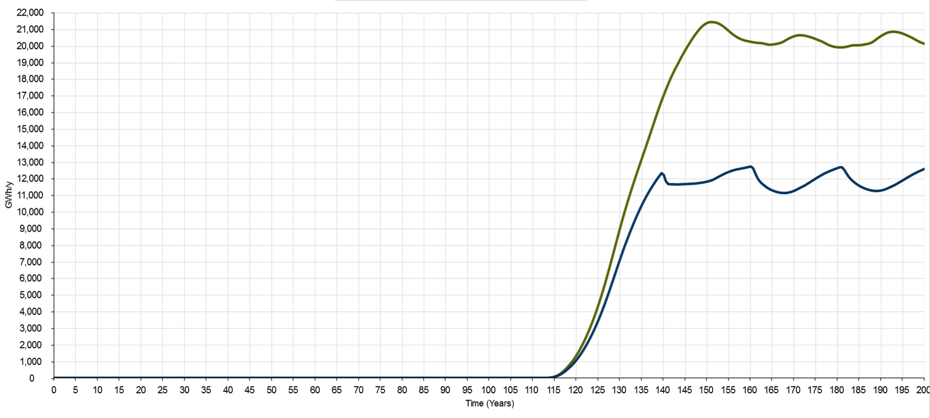
Figure 14: Battery capacity emplaced annually (wind portion in blue, PV portion in green)
Battery capacity emplaced annually is shown in figure 14. By year 120, the wind & PV portions reach 1000 GWh/year and 1500 GWh/year respectively. For reference, the Tesla Gigafactory’s design capacity for battery packs is 50 GWh/year. So 7 years from the start of the transition phase, battery demand for stationary supply (i.e. omitting demand for electric vehicles) is equivalent to 50 Gigafactories. This sounds highly ambitious, though not insurmountable. But what happens from there? Well, it’s only upward. The battery emplacement rate associated with wind electricity supply peaks initially at over 12,000 GWh/year just prior to year 140, before dropping back a little. It then peaks again just short of 13,000 GWh/year at year 160. From there, the rate cycles between 13,000 and 11,000 GWh/year, in phase with the reasonably optimistic operating life of 20 years, out to year 200. The PV portion peaks around 21,500 GWh/year at approximately year 153. It then drops back a little and cycles, again with a period of 20 years, between 20,000 and 21,000 GWh/year.
This is equivalent to the output of 650 Gigafactories, not just in a one-off “world building” effort that then pays off over several human generations, but each year, every year, in perpetuity. Keep in mind, this would only maintain the current level of energy services to the global economy, without further growth. Between year 113 and year 153, based on the first Gigafactory’s US$5 billion capital cost, annual net fixed capital formation for the factories alone (i.e. ignoring all other parts of the supply chain, and depreciation of the existing battery manufacturing capacity), would amount, in 2015 dollars, to around US$80 billion.
The annual capital investment figure for new battery factories does not seem to pose an overwhelming challenge in its own right, but to place it in context, consider that current global investment in all renewable energy supply capacity is in the region of US$250-300 billion. A little further on I’ll look more closely at the broader capital investment implications.
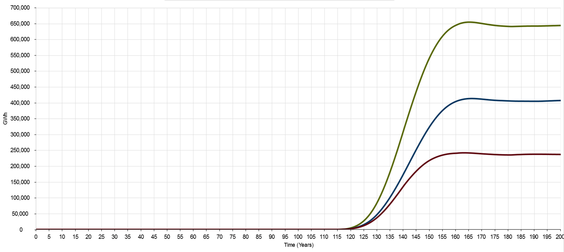
Figure 15: Cumulative battery storage capacity (wind fraction in red, PV fraction in blue and total in green)
In figure 15, we see the cumulative effect of the high battery emplacement rates. Total capacity peaks at just over 650,000 GWh, at year 165, and reaches effective steady-state just below this level. This is equivalent to 6.5 billion of Tesla’s 100 kWh utility-scale Powerpack batteries. It’s here that the scale implications of the autonomy periods included in the standard run—72 hours for wind, 154 hours for PV—start to really hit home. The cost just for each battery pack alone is US$25,000, with—if the transition was to start today, in 2015—one unit required for every 1.4 members of the global human population forecast for 2060.
Here we start to build up a more tangible sense of the scale involved. At around US$18,000 per capita, the battery packs alone account for an extraordinarily large share of the global mean per capita capital stock, for which the order of magnitude is in the region of US$10,000 per capita. This suggests that the autonomy periods under consideration in the standard run may be somewhat ambitious.
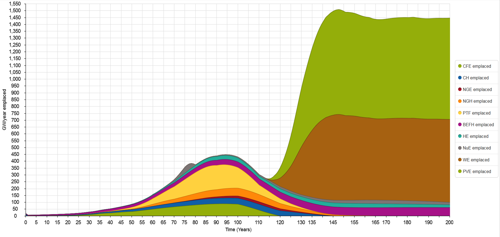
Figure 16: Nameplate supply capacity emplaced annually, all sources
This is an appropriate juncture to bring the emplacement rates for nameplate wind & PV electricity generation capacity back into the picture. Figure 16 presents the emplacement rate data previously shown in figure 3, but now places these in the context of emplacement rates for all sources. The contrast is starkly apparent. Prior to the transition, the sum total of annual emplacement for all conventional energy sources peaks at 450 GW/year, in year 95. At their combined peak around year 153, the total emplacement rate for wind, PV, hydro, nuclear and biomass nameplate supply capacity is just over 1,500 GW/year. Wind & PV account for approximately 90% of this total. This comprises around 40% wind and 50% PV. In other words, emplacement rates for both wind and PV eclipse the maximum total for all other sources. And these annual emplacement rates must be maintained continuously to maintain steady-state supply. Yet the combined gross output from wind & PV is only around 30% greater than the combined output of the biomass, hydro and nuclear supply capacity (see figure 6). Moreover, the combined gross output from wind, PV, biomass, hydro and nuclear peaks at only 80% of the pre-transition total. It’s the story portrayed in figure 16 that has led me previously to point out that while wind & PV don’t require any direct fuel inputs, they do necessitate continuous inputs of turbines and panels.
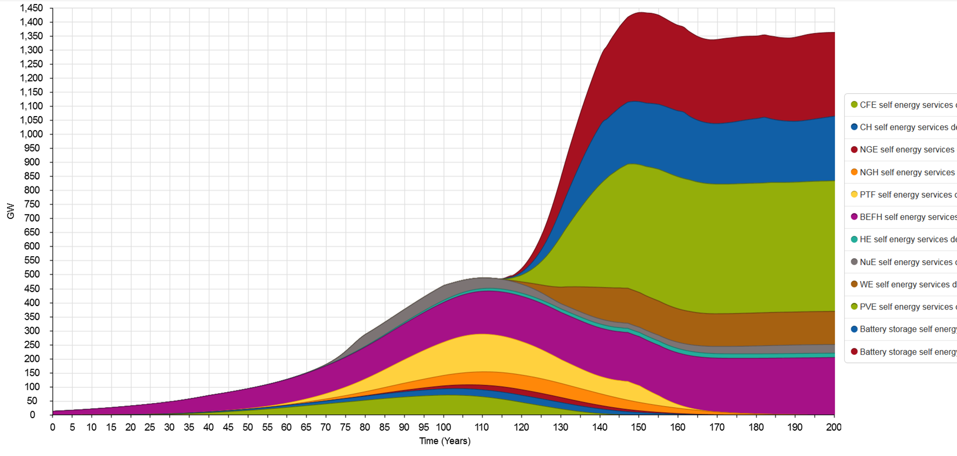
Figure 17: Self-energy services demand rates for all energy sources
Finally, in figure 17, we see the impact of the transition in terms of the self-energy service demand rates for each source. This provides a breakdown of the components making up the energy sector total represented by the blue line in figure 2. Here we see the relatively modest demand for energy services from wind generation (brown wedge). However, when battery buffering is included (upper dark blue wedge), the overall magnitude trebles. On the other hand, the self-energy demand for PV is dominated by the generation capacity component (upper green wedge), even with a battery buffering autonomy period double that of wind. Here, the lower capacity factor of PV has a marked effect, by increasing the relative quantity of nameplate capacity that must be emplaced for a given output. The principal feature of note here, however, is the relative size of the aggregated self-demand associated with battery-buffered wind & PV compared with the aggregated self-demand for all other sources, at any time during the simulation. Over the full 200 year simulation period for the standard run, the total wind & PV self-demand for energy services (the combined area of the brown, upper green, upper dark blue and upper red wedges) eclipses all other self-demand for energy services (the combined area of all other wedges).
Capital investment implications
[Note: the capital cost estimates in this section are superseded in the following post, in which simulation results are discussed for model updates that include calculation of levelised cost of electricity for wind and PV]
Here I’ll present a final snapshot to give a sense of the transition scale implied by the standard run. This compares a rough estimate of the capital cost for battery-buffered wind & PV electricity generation, with recent actual and estimated future capital expenditure for all energy sources, and with annual global gross fixed capital formation.
In its World Energy Investment Outlook 2014, the International Energy Agency (IEA) envisages that “Over the period to 2035, the investment required each year to supply the world’s energy needs rises steadily towards $2,000 billion”.[10, p.11] According to the IEA report, in 2013 global capital investment in energy supply was $1,600 billion. The 2013 figure represents a little under 9% of the 2013 world gross fixed capital formation, reported by the World Bank at US$18,380 billion.
For the sake of the exercise I will take the short-cut of bringing forward to the present the maximum emplacement rates for wind & PV generation capacity, and for battery storage. This will allow current costs to be applied accurately, and will also allow a meaningful comparison to be made with current capital expenditure.
The emplacement rate for wind generation capacity levels off around year 150 at approximately 600 GW/year. PV levels off at the same time, at just under 750 GW/year. Battery storage capacity emplacement also plateaus around this time, at approximately 12,000 GWh/year (wind) and 20,500 GWh/year (PV), for a total of 32,500 GWh/year.
The US Department of Energy estimates capital cost of utility-scale PV for 2016 in the range US$1.30-1.95 per watt. I’ll use the lower bound figure of US$1.30 per watt. Based on data from the Australian Government’s Bureau of Resource and Energy Economics publication Energy in Australia 2013, total capital expenditure for the 2,315 MW of wind generation under development in the previous reporting period was anticipated at AU$5,960 million, translating to roughly US$1.80 per watt.[11] For the battery capital cost indicator, I will use the US$25,000 purchase price for Tesla’s utility-scale 100 kWh Powerpack, or US$0.25 per watt-hour. This is the outlay for batteries only, omitting installation costs and associated plant & equipment.
On this basis, the annual global capital investment for wind generation capacity comes in at US$1,080 billion. Annual PV investment is US$950 billion, for a combined wind & PV total of US$2,030 billion. Battery investment overshadows both combined though, at US$8,125 billion. It would be of sufficient note here that capital investment for wind & PV generation capacity alone almost matches the actual 2013 global total investment in all energy supply. This clearly suggests that a transition to an (almost) 100% renewably powered world is an undertaking with more far-reaching consequences than many proponents envisage.
Add the battery storage component though, with the annual capital investment reaching a combined US$10,155 billion, and the situation takes on a decidedly more extreme character. Remember, this is still not total annual investment in energy supply, just wind & PV generation capacity and the batteries for storage. The model scenario also includes a large quantity of biomass, hydro and nuclear supply capacity requiring ongoing capital investment. Bear in mind, also, that this is to maintain energy services to the rest of the economy equivalent to what is available today. So despite bringing these investments forward to the present from circa 2050, the task being met is roughly equivalent to the global energy supply task today (in fact, it is less demanding than today’s, due to the improvements in conversion efficiency from energy to energy services by the time the peak emplacement rates are reached). For the components included, capital investment based on the model’s standard run would come in at 55% of world gross fixed capital formation in 2013, compared with the actual figure of 9%.
Even if sound arguments can be made for the wind & PV autonomy periods in the standard run being excessive, the situation would not change fundamentally. Consider a scenario with only 24 hours of autonomy for both wind & PV. Annual capital investment in wind capacity drops back to US$990 billion. PV drops to US$863 billion. Combined generating capacity investment is US$1,863 billion. But battery storage still requires annual capital investment of US$1,625 billion, essentially equal to the 2013 actual figure for all energy investment. The total of US$3,488 billion would still be over double the actual figure. Once again, compare this with the IEA’s estimate for 2035 expenditure on all energy supply of just US$2,000 billion (in 2013-equivalent dollars).
Will heat pumps save the day?
Before wrapping up, I’ll briefly address the matter of heat pumps (space and water heaters that work on the same principle as refrigerators and air conditioners). With a shift to a global energy supply dominated by electricity, it is often argued that maximising the use of heat pumps will lead to much reduced demand for energy services. This is because a heat pump can deliver a quantity of useful heat several times greater than the mechanical or electrical energy required to power it. I have omitted any explicit consideration of this in the model, on the basis that, while potentially very significant at the micro-economic scale of households and businesses, the impact is in fact quite modest at the global macro-economic scale.
Heat pumps could be taken into account in one of two ways though. Either the conversion efficiency from electricity to energy services could be increased to reflect increasing use of heat pumps; or the contribution of residential, commercial and public sector space and water heating to the overall energy services supply task could be reduced accordingly. I’ll use the latter approach to demonstrate the potential scale of the reduction due to maximised use of heat pumps.
The substitution relates almost entirely to the natural gas heating component of the overall energy supply task. In the model, this reaches a maximum of 1,350 GW pre-transition. For Australia, residential and commercial natural gas consumption is just over 25% of the total. Due to Australia’s mild climate, this is likely much lower than the global mean. I will assume that 50% of global natural gas heating, or 675 GW, is accounted for by residential and commercial use. I will also assume that all of this is associated with space and water heating, and that the full amount will be provided by heat pumps by the end of the transition phase.
Assuming a global mean heat pump coefficient of performance, for all applications, of 4.0, each unit of electrical energy provides 4 units of heating. That is, the electrical energy required to meet a given heating demand is 25% of the heat required. To provide 675 GW of residential and commercial space and water heating will therefore require just under 170 GW electricity at the point of use. The corresponding reduction in the electricity required by the “rest of the economy” is 75% of 675 GW, and roughly 90% of this amount in terms of total final energy services, for an overall reduction of 456 GW. Nominal demand for total final energy services would therefore drop from the pre-transition maximum of around 5,700 GW, to approximately 5,250 GW, or an 8% reduction.
This could be considered as a conservative upper bound. There is enormous latent global demand for energy services that would remain unmet under the model’s assumption of post-transition steady-state supply. On top of this, the economy must absorb many new energy costs (including the emplacement energy for the heat pumps themselves) that are not explicitly identified. In light of this, it seems that the reduction is not sufficiently significant to warrant specific inclusion here.
[UPDATE 2 September 2015: I have now created an updated version of the model that thoroughly overhauls the way that conversion efficiencies between energy and services are handled. In doing so, I have also refined the actual conversion efficiency values. This includes the use of heat pumps for low temperature space and water heating, but also reduces the aggressiveness of the learning curves for self-energy demand relative to global aggregate energy conversion efficiency. Ongoing development of the model will now shift to the updated version, which is available here. An Excel spreadsheet with calculations relating to the conversion efficiency refinements, including all assumptions relating to specific types of work & heat conversion, is available here.]
Summing up
The model, while comprehensive, is very “coarse-grained” in terms of its level of detail. Including features such as maximised heat pump use would be interesting to look at if developing a more fine-grained model, but would be unlikely to produce major divergence from the overall results. [This is now confirmed by the simulation results from the updated version of the model discussed above.]
The standard run’s broad implication is that transitioning to a supply mix along the lines included in the model would entail not just a shift in energy sources, but a fundamental restructuring of the global economy. Setting aside questions such as whether the scale of the task is feasible, and how to overcome the energy trap during the transition phase, the standard run challenges the widespread assumption that the global economy’s energy subsystem can simply be “swapped out” with minimal disruption. A shift to a renewably powered world is likely to require a far more integrated approach than is currently envisaged, starting with a close examination of social and economic priorities and the levels of energy services that these entail.
I don’t claim that the model simulation provides definitive answers. There are design elements that some will object to—the use of results from Prieto & Hall’s utility-scale PV study as the basis for modelling global mean PV electricity supply comes to mind here. But what alternative basis should be used in place of this? And, what would be the overall effect on the simulation results? I hope this has demonstrated in a relatively accessible way the type of approach that is needed to start grappling with the hard questions of energy transition—and that it might encourage more widespread and constructive engagement with the issues at play.
References
[1] Prieto, Pedro A., and Charles A.S. Hall. 2013. Spain’s Photovoltaic Revolution: The Energy Return on Investment. Edited by Charles A. S. Hall, SpringerBrief in Energy: Energy Analysis. New York: Springer.
[2] Carbajales-Dale, Michael, Charles J. Barnhart, and Sally M. Benson. 2014. “Can we afford storage? A dynamic net energy analysis of renewable electricity generation supported by energy storage.” Energy & Environmental Science no. 7 (5):1538-1544. doi: 10.1039/c3ee42125b.
[3] Crawford, R. H. 2009. “Life cycle energy and greenhouse emissions analysis of wind turbines and the effect of size on energy yield.” Renewable and Sustainable Energy Reviews no. 13 (9):2653-2660. doi: http://dx.doi.org/10.1016/j.rser.2009.07.008.
[4] Kessides, Ioannis N., and David C. Wade. 2011. “Deriving an Improved Dynamic EROI to Provide Better Information for Energy Planners.” Sustainability no. 3 (12):2339-57.
[5] International Energy Agency. 2002. Environmental and Health Impacts of Electricity Generation. The International Energy Agency–Implementing Agreement for Hydropower Technologies and Programmes, viewed 19 August 2015 at http://www.ieahydro.org/reports/ST3-020613b.pdf.
[6] Moriarty, Patrick, and Damon Honnery. 2012. “What is the global potential for renewable energy?” Renewable and Sustainable Energy Reviews no. 16 (1):244-252. doi: http://dx.doi.org/10.1016/j.rser.2011.07.151.
[7] Honnery, Damon, and Patrick Moriarty. 2009. “Estimating global hydrogen production from wind.” International Journal of Hydrogen Energy no. 34 (2):727-736. doi: http://dx.doi.org/10.1016/j.ijhydene.2008.11.001.
[8] Andrews, Roger. 2015. “How Much Battery Storage Does a Solar PV System Need?”. Energy Matters, viewed 22 August 2015 at http://euanmearns.com/how-much-battery-storage-does-a-solar-pv-system-need/.
[9] Andrews, Roger. 2015. “A Potential Solution to the Problem of Storing Solar Energy – Don’t Store It”. Energy Matters, viewed 22 August 2015 at http://euanmearns.com/a-potential-solution-to-the-problem-of-storing-solar-energy-dont-store-it/.
[10] International Energy Agency (IEA). 2014. World Energy Investment Outlook. Paris: International Energy Agency, viewed 29 August 2015 at http://www.iea.org/publications/freepublications/publication/WEIO2014.pdf.
[11] BREE. 2013. Energy in Australia 2013. Canberra: Bureau of Resources and Energy Economics, Commonwealth of Australia, accessed 29 August 2015 at http://www.industry.gov.au/Office-of-the-Chief-Economist/Publications/Documents/energy-in-aust/bree-energyinaustralia-2013.pdf.

Pingback: The energy costs of energy transition: model refinements and further learning | Beyond this Brief Anomaly