
In this post I’ll discuss further developments relating to the energy transition modelling exercise covered in detail in the previous two posts (here and here). Consistent with Beyond this Brief Anomaly‘s inquiry ethos, I view the exercise as effectively open-ended. The findings at any point in time can be considered provisional and subject to refinement or revision as learning unfolds, as new ways for making sense of the modeled situation come to light, and as the ways in which the situation itself is understood change. This particular modelling effort should not be treated as the “last word” on the subject. Indeed, the best outcome from the work would be an increased public concern for the dynamics of energy transition — leading to new initiatives that explore the implications independently, going beyond what is possible with this relatively modest foray.
Nonetheless, the findings to date from this work demand close consideration from anyone seriously committed to renewable energy transition. The essential insight is this: in the rapid build-out required for a major transition in primary energy sources, effective aggregate energy return on investment (EROI) for a replacement source’s total stock of generators is lower than for an individual generator considered in isolation. The overall EROI ramps up from zero at the commencement of the transition, only reaching the nominal value for an individual generator over its full life-cycle when the transition is effectively complete i.e. when the generator stock reaches a steady state. All of the other key findings flow from this fundamental feature of any rapid transition in primary energy source. If a replacement energy source has lower nominal EROI than incumbent sources, then this becomes a critically important feasibility consideration.
The specific model developments introduced here are summarised as follows (I’ll discuss each in more detail below):
- The conversion of power outputs to energy service outputs in the form of heat and work for each supply source has been thoroughly overhauled, resulting in a far more refined implementation of this feature of the model.
- Conversion of self-power demand to emplacement and operating & maintenance (O&M) energy service demand in the form of heat and work has also been modified for each supply source.
- The maximum autonomy period that determines the amount of energy storage for wind and PV electricity can now be increased gradually as the intermittent supply penetration increases as a proportion of total electricity supply.
- For the default parameter set (now called the “reference scenario”, previously “standard run”), the maximum autonomy periods for wind and PV supply are arbitrarily reduced to 48 and 72 hours respectively, simply for the sake of heading off any knee-jerk response along the lines that “the amount of storage assumed to be necessary is unrealistic, therefore the entire model is suspect”.
- Detailed calculation is now included for levelised capital cost and O&M cost for wind and PV supply plant, and levelised capital cost for batteries (making the discussion of this in the previous post now redundant).
The updated version of the model to which this post relates is available here.
The full parameter set for the updated model’s “reference scenario” (equivalent to the “standard run” in previous posts) is available as a PDF here.
Brief comments on findings from the revised model’s “reference scenario”
The model behaviour for the default “reference scenario” in the revised model is very similar to that described in detail in the previous post, both in terms of qualitative “shape of response” characteristics and in terms of many output parameters. That’s to say, the model refinements do not change the overall story told in the previous post in any substantive way. The major refinements in conversion efficiency from power outputs to energy services outputs do result in some notable changes. The post-transition energy services ratio increase from around 4:1 to around 6:1 is especially noteworthy. There is also a modest reduction in the depth of the decline in energy services during the transition phase.
Reducing the autonomy periods (amounts of battery storage) for wind and PV electricity obviously has a significant effect in relation to self-power demand and capital cost associated with storage, but this follows from an assumption about a default input parameter, rather than from the modelling methodology or model structure. As it turns out, the overall energy availability consequence of this is more than off-set by the implications of refining the way that conversion efficiencies between energy outputs and self-demand, and energy services, is handled. It should be kept in mind also that this comes at the necessary cost of reduced confidence in supply reliability, and so the benefit provided in terms of apparently improved overall transition feasibility remains contestable.
Full details for the reference scenario can be obtained by running the model with its default parameter set (simply click on the button labelled “Simulate” at top left of screen in the Insight Maker model window) and scrolling through the simulation results charts. Readers can run their own alternative scenarios by clicking on the “Link Results to Model” icon at top right of the simulation results window (left-most of the five icons), restoring down the window and adjusting parameters via the input boxes (recommended) or sliders in the panel at right of screen, below the text on yellow background describing the model. For more details on this, see the post introducing the original version of the model here.
Financial costs of energy transition: wind and PV electricity supply
The significant new data provided by the revised model relates to the financial costs of electricity supply from onshore wind and utility-scale PV generation. Principal outputs for the reference scenario are presented in figures 1 to 6 and figures 9 and 10 below. All values are given in 2015 US dollars.
Figure 1 shows annual total capital investment in wind plant, PV plant and batteries, rising to a mean of roughly $3 trillion, around 35 years into the approximately 50 year transition period. As discussed in the previous post, this can be compared with the International Energy Agency’s forecast for investment in all global energy supply in 2035 of $2 trillion per year, presented in its World Energy Investment Outlook 2014. Note also that the “zero storage” baseline is around $1.5 trillion per year, so even storage options cheaper than lithium ion batteries (or dispatchable backup, for that matter) have little headroom available, if the IEA investment figure is taken as a rough “affordability benchmark”. This is not to suggest that this necessarily should be treated as such a benchmark, but given the status of IEA data in relation to national energy planning, actual investment requirements that exceed its forecasts will likely have significant macro-economic implications.

Figure 1: Annual capital investment in wind plant, PV plant and batteries.
Figure 1 gives the “principal only” capital investment requirements. Applying the reference scenario discount rate of 7 percent per annum, the aggregate levelised cost of capital (that is, the cost of capital, including financing cost, for all plant and equipment currently being paid for in any given year) rises to around $5.8 trillion (see Figure 2).

Figure 2: Annual levelised captial cost sums for wind plant, PV plant and batteries.
This provides a basis for considering the overall economic scale of the modeled transition. While this is important for exploring viability and consequences at the global macro-economic scale, the implications of the dynamic view afforded by the model come into clearer view when we look at costs per unit of electricity delivered. Figures 3 (wind plus batteries) and 4 (PV plus batteries) illustrate the dramatic effect of very high investment rates associated with rapid transition. An initial spike occurs in the annual capital investment per unit of gross electricity output, with the ratio then declining during the transition period as supply capacity comes on-line. The peak value of the spike is around an order of magnitude greater, though, than the long-term steady state investment rate. A clear message can be discerned here: during a period of rapid supply transition, the capital intensity for new energy sources will initially be far greater than the long-term mean. This clearly has major implications for transition planning, if not for overall feasibility.
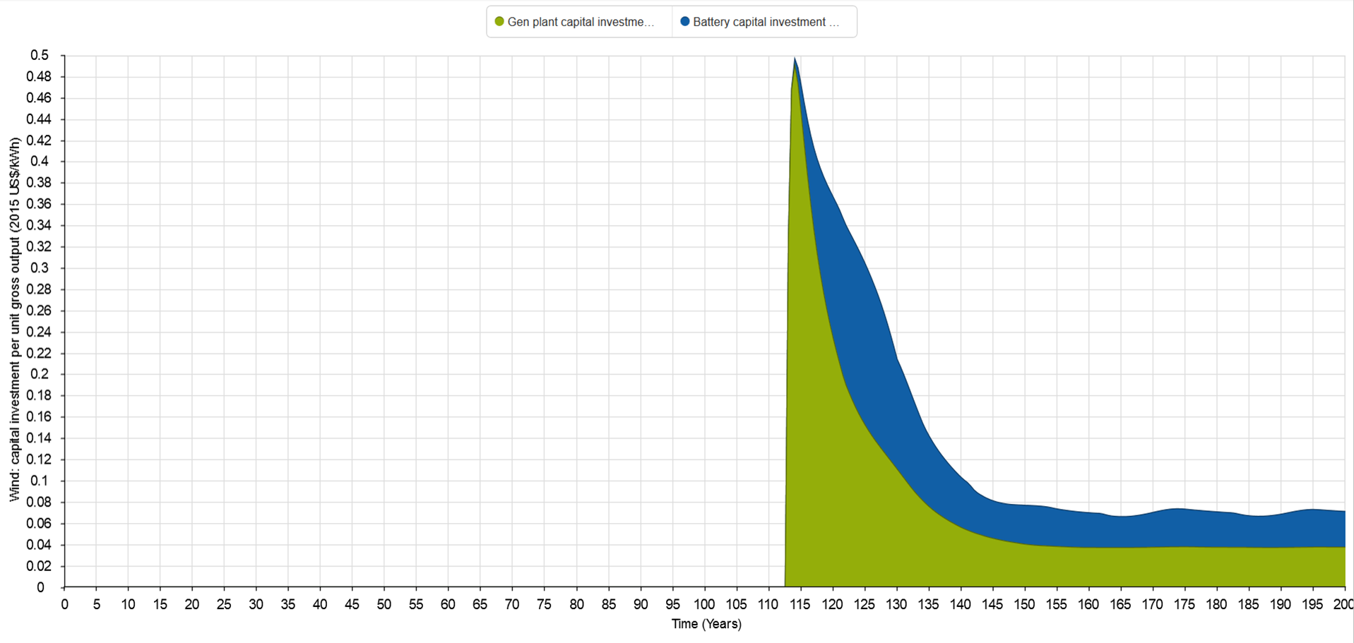
Figure 3: Wind plant and battery capital investment per unit gross output.

Figure 4: PV plant and battery capital investment per unit gross output.
While the index depicted in figures 3 and 4 illustrates clearly the impact that transition dynamics has on investment for a particular source, it does not have any specific significance within conventional economic feasibility assessment frameworks. For large-scale energy planning, levelised cost of electricity (LCOE) is often used as a bench-marking basis for comparing the economic viability of competing supply sources, and so offers a more practical index for presenting the model’s simulation results. Figures 5 and 6 show LCOE (levelised cost of capital plus levelised operating and maintenance [O&M] cost) and battery levelised cost of capital per unit of gross ouput, for wind and PV respectively. For wind, LCOE converges on a steady-state value of around $0.09/kWh, and with batteries included, $0.15/kWh. For PV, the figures are around $0.14/kWh and $0.23/kWh respectively.

Figure 5: Wind plant LCOE and battery levelised capital cost per unit gross output.

Figure 6: PV plant LCOE and battery levelised capital cost per unit gross output.
The specific values for each of the cost components shown are obviously dependent on the cost and discount rate assumptions used in the reference scenario. In this sense they are specific to the model, and not intended to be directly comparable to LCOE forecasts from other sources. Nonetheless, comparison with published LCOE forecast data provides a quick rule-of-thumb check on the credibility of the model outputs. Figures 7 and 8 show the estimated LCOE for new generation resources coming on-line in the USA, in 2020 and 2040 respectively. The data used to prepare the charts is from the US Energy Information Admininistration’s Annual Energy Outlook 2015. For onshore wind, LCOE is forecast to be around $0.07/kWh in 2020 and 2040. For PV, LCOE is forecast at $0.12/kWh in 2020 and $0.11/kWh in 2040.
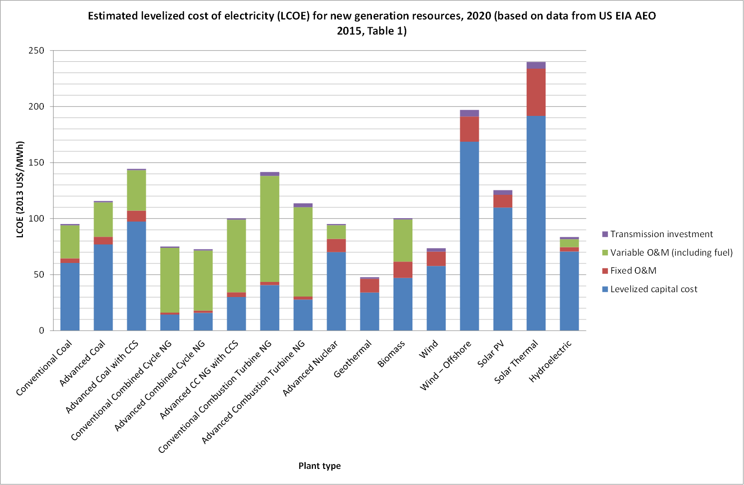
Figure 7: Estimated levelized cost of electricity (LCOE) for new generation resources, 2020 (based on data from US EIA AEO 2015, Table 1, viewed 22 November 2015 at http://www.eia.gov/forecasts/aeo/electricity_generation.cfm)

Figure 8: Estimated levelized cost of electricity (LCOE) for new generation resources, 2040 (based on data from US EIA AEO 2015, Table A5, viewed 22 November 2015 at http://www.eia.gov/forecasts/aeo/pdf/appendix_tbls.pdf)
While the difference in the relative weighting of capital and O&M costs between the EIA estimates and the model reference scenario results is more significant than the differences in absolute LCOE values, these differences all fall well within the range of plausible input parameter assumptions. In other words, the simulation results from the model can readily be made to replicate the EIA estimates simply by manipulating the user input parameters relating to LCOE, within the pre-set ranges. This suggests that the LCOE outputs from the model for wind and PV can be treated as credible, and that the model provides a useful tool for exploring how the inclusion of batteries for energy storage affects LCOE. It is of particular note that when LCOE is calculated using gross electricity output, as is the case above, dynamic effects on cost are not apparent. LCOE for both wind and PV rises rapidly and smoothly from zero at the start of the transition period, converging on the long-term steady state mean value well before the end of the transition.
To appreciate the implications of both EROI and transition dynamics on LCOE, we need to consider LCOE on a net output basis. This gives the levelised cost of electricity supply per unit of output to the economy, after the energy costs of supply are deducted. This is shown in figures 9 and 10, for wind and PV respectively. The relative increase in LCOE from gross output to net output basis, and the relative change in LCOE from start of transition to post-transition are the features of interest here.
For wind, LCOE (net output basis) converges on $0.10/kWh post-transition. It reaches a peak early in the transition phase, though, of just over $0.18/kWh. With battery cost included, the peak is just over $0.21/kWh, and the steady state post-transition LCOE is almost $0.17/kWh.
For PV, the situation is markedly different. In fact, from a macro-scale perspective, net output basis LCOE is of no meaning during the early transition phase: PV is a net energy user rather than a net supplier for roughly the first 18 years of the transition period. In figure 10, the model simulation output data is simply presented in raw form, in effect as a “negative cost”, implying that PV requires both full energy and financial subsidisation during this period. At the micro-economic scale, however, this effect is masked: each individual generator, once in operation, will provide an electricity output that is available for sale to customers and that hence can generate a revenue stream from which costs can be recovered. Provided markets are structured so that there is a sufficiently favourable price differential between the electricity output from PV, and energy inputs required by it, the consequences of this will be invisible at the micro-economic level while still being carried in full by the macro-economy.
When the PV supply stock, in aggregate, crosses over from being a net energy user to a net supplier after approximately 18 years, gross output basis LCOE does become a meaningful index. Initially though, LCOE from PV is extremely high. In figure 10, the chart range has been restricted to $1.00/kWh, but it is a further 2 years before the net output basis LCOE actually declines to this level from an initial maximum that is many times higher (and close to 4 years, when battery levelised capital cost is included). By approximately 23 years after the start of the transition, the net output basis LCOE has declined to roughly $0.50/kWh. A steady state value of approximately $0.20/kWh is finally reached post-transition, near 50 years after commencing. With batteries included, the steady state LCOE (net output basis) is around $0.34/kWh.

Figure 9: Wind plant LCOE and battery levelised capital cost per unit net output.

Figure 10: PV plant LCOE and battery levelised capital cost per unit net output.
It is important to note that the index implemented in the model is based on net energy output rather than net electricity output, which is more directly relevant when specifically calculating cost of electricity. That is, what we would ideally like to know is how much electricity is available to the rest of the economy, after electricity used by the supply system itself is deducted. On the other hand, as the proportion of electricity in the overall energy supply increases, net energy provides an increasingly accurate proxy for net electricity. In a situation where all energy used by wind and PV is in the form of electricity, then the proxy value and actual net output would be the same. It should also be noted that the effect of the learning curve for self-power demand is omitted in calculating net energy. Applying the learning curve would result in the steady state LCOE (net output basis) converging on a slightly lower value.
Comparisons of gross and net output basis LCOE values for wind and PV, with and without batteries included, is presented in the summary tables below:
| Supply source (without batteries) |
LCOE (gross output basis)
($/kWh) |
LCOE (net output basis) – transition peak
($/kWh) |
LCOE (net output basis) –steady state
($/kWh) |
| Wind | 0.09 | 0.18 | 0.10 |
| PV | 0.14 | >>1.00 | 0.20 |
| Supply source (batteries included) |
LCOE (gross output basis)
($/kWh) |
LCOE (net output basis) – transition peak
($/kWh) |
LCOE (net output basis) –steady state
($/kWh) |
| Wind plus batteries | 0.15 | 0.21 | 0.17 |
| PV plus batteries | 0.23 | >>1.00 | 0.34 |
Model developments in detail
The remainder of the post provides details relating to the recent model developments.
1. Converting power outputs to energy service outputs
Previously this was implemented via a rule-of-thumb estimate of average conversion efficiency from each energy source to a basket of final energy services in the form of heat and work, modified via a learning curve to give improved conversion efficiency over time.
In the revised model, this is has been thoroughly overhauled. The approach taken is to ensure that the distribution of total gross energy services delivered to the economy across four major categories (high temperature heating; low temperature heating; transport work via onboard energy storage; and all other work) matches very closely pre- and post-transition. In other words, the conversion efficiency from gross power output to gross energy service output for each energy source is set so that, overall, each energy service category accounts for the same proportion of energy services before and after the transition. A separate spreadsheet model was developed for this purpose, available for download here (Excel file). The total gross energy services out from each of the pre-transition energy sources is allocated to one or more of the four major energy service categories. This is shown in Table 1 below (based on the Excel file linked above):

Table 1: Pre-transition allocation of gross energy services out from each energy source to one or more of four energy service categories.
The post-transition conversion efficiencies assumed for each energy service category are shown in Table 2 below. The same efficiencies are used to calculate the overall conversion efficiency for each energy source pre-transition, based on the observation that most of the scope for potential future energy efficiency improvement lies in the relationship between energy services and economic production, rather than in the relationship between final energy supply and energy services in the form of work and heat. In other words, it is assumed that improvements in conversion from specific energy forms to desired services will be relatively modest (e.g. improvement in internal combustion engine thermal efficiency), compared with improvements due to use of different energy forms to deliver a similar service (use of electrically-powered heat pumps in place of natural gas combustion for space heating), or change in the nature of service expectations (increased use of smaller, shared-ownership electric vehicles and public transport in place of larger, user-owned ICE vehicles). The latter example could be taken to imply an effective increase in energy service utility, for the same energy services delivered in the form of work and heat. In terms of what this means for the model findings, we can infer that the principal transition criterion of achieving equivalent net work and heat availability pre- and post-transition does allow scope for global increase in economic output, where this is enabled via an increase in the productivity of work and heat. The extent to which this might be achieved in practice is a question that the model is not intended to explore though.
Table 2: Post-transition conversion efficiencies for each energy service category
The allocation of the post-transition gross energy services out from each source to each of the four major categories is shown in Table 3 below:

Table 3: Post-transition allocation of energy services for each source to one or more of four major energy service categories.
Note that the figures in Tables 1 and 3 above relate to the “standard run” of the model version discussed in the previous posts. These figures were used to derive the mean conversion efficiency values for each energy source that would provide energy service parity in each of the four major categories pre- and post-transition. The mean conversion efficiency values so derived were then fed into the revised model. This resulted in changes to the values of the gross energy service outputs relative to those that had been used as inputs in the previous step. That is, changing the conversion efficiency values, changes the calculation basis for those same conversion efficiency values — there is a feedback loop here. As such, it was necessary to check the magnitude of the resulting changes in the mean conversion efficiency values for each energy source. If the magnitude of the changes was significant, then the conversion efficiency values would need to be iterated, until convergence was reached i.e. until changes in the mean conversion efficiency values fed to the Insight Maker model as inputs resulted in no significant change when the resulting values for gross energy services were fed back into the spreadsheet from the Insight Maker model. As it turned out, an acceptable degree of convergence was reached in a single iteration. Details are provided in the Excel spreadsheet model.
2. Converting Self-Power demand to Emplacement and O&M energy service demand
In the previous model version, this was achieved via a (very rough) rule-of-thumb estimate of the relationship between required energy inputs and actual services. In the revised model, the global mean conversion efficiency from total gross power output to total gross energy services supplied to the economy is calculated dynamically. The economy-wide conversion efficiency at (approximately) the time of transition commencement is then taken as the baseline for the relationship between self-power demand and emplacement and O&M energy service demand for each source. That is, it is assumed that all parameters relating to energy investment are taken to be current at the time of transition commencement. This reference global mean conversion efficiency is set as a user-adjustable input, to allow for iteration of the value if changes in other input parameters lead to significant change in the global mean conversion efficiency at the time of transition commencement (e.g. under parameter assumptions other than those used in the reference scenario).
A time-variable adjustment factor (i.e. with an assumed learning curve built in) specific to each energy source is applied to the global mean conversion efficiency so that some multiple of the global value is applied to each source. For wind and PV plant, the adjustment factor decreases from greater than 1 pre-transition to less than 1 post-transition. For battery production, a learning curve is applied directly to the embodied energy, and so the corresponding adjustment factor reduces from greater than 1 pre-transition, to 1 post-transition.
For the purpose of calculating net output basis LCOE, the reference self power demand for wind, PV and batteries is adjusted to a current actual value using the global mean conversion efficiency from power to services out to the economy. That is, while the energy services (work and heat) required to emplace and operate and wind, PV and battery plant & equipment is assumed to be relatively stable (though reducing over time via the learning curves), the energy inputs required to provide these services varies with the global mean conversion efficiency. As this conversion efficiency increases, self power demand reduces (and vice versa).
This approach allows for simple and transparent comparison of energy use by the energy sector with energy use for economic production in the overall economy. These relationships can then be adjusted, if desired (though at this stage this is not available via direct user input and would require cloning of the model — see the first post in this series for details on how to go about this).
3. Ramping of maximum autonomy periods for Wind and PV battery storage
In the previous model version, the maximum autonomy periods for battery storage were fixed at user-adjustable constant values. This meant that as soon as wind or PV generation capacity emplacement commenced, the target for battery storage capacity was set to allow delivery of the current mean electricity supply rate for the maximum autonomy period. This does not provide an accurate representation of what we would expect to happen in practice, as storage associated with intermittent electricity sources provides far less benefit to the overall supply system at low intermittent supply penetrations. The supply reliability benefit provided by storage increases as the overall proportion of intermittent electricity supply increases. This means that at lower penetrations, we should expect to see levels of storage based on lower autonomy periods. The maximum autonomy period becomes more relevant at higher penetrations, beyond a certain intermittent electricity supply proportion threshold.
This is now accounted for in the model by allowing the autonomy periods for wind and PV electricity to ramp from zero hours at zero supply capacity, up to the user-adjustable maximum value at a user-adjustable intermittent penetration threshold, specified as the proportion of intermittent supply (i.e. wind and PV) in the overall electricity supply. In the reference scenario, the threshold proportion is set to 40 percent. This means that energy and financial investment costs associated with battery emplacement are far more modest during the early years of the transition phase. For the reference scenario, the threshold level is reached approximately 20 years after the transition commencement.
The ramping function uses an elliptical curve to interpolate the autonomy period between zero penetration and the threshold value. The form of the interpolation function is as shown below:
 Where: y is the proportion of the maximum autonomy period target that is used to determine the amount of storage required at the current time (see variable [Proportion of max autonomy period for battery storage target] in the Insight Maker model), x is the maximum proportion of intermittent electricity in the overall supply realised to date (see [Intermittent electricity supply proportion max value]) and t is the threshold for the proportion of intermittent electricity in the overall supply at which the maximum autonomy period takes effect (see [Intermittent supply proportion threshold for max autonomy period]).
The elliptical function is used to avoid modelling instabilities associated with too-sudden changes (i.e. discontinuities) in the target autonomy period from one time step to the next. This means that the autonomy period initially rises relatively rapidly, with the rate of increase tapering off as the threshold proportion is approached. The effect is very modest though, and to the eye the ramping appears linear, with a transition curve at start and finish.
4. Reduced Maximum Autonomy Periods
The default parameter values for wind and PV maximum autonomy values in the previous version of the model (i.e. the “standard run”) were 72 and 148 hours respectively. For the reference scenario in the revised model, these values are reduced to 48 and 72 hours respectively. This reduction does not reflect any change to the maximum autonomy period rationale presented in detail in the previous post. It simply reflects a pragmatic decision to position the reference scenario more moderately relative to mainstream-popular renewable energy discourse. For example, an autonomy period in the order of 72 hours is often used as a rule-of-thumb starting point for considering the design of stand-alone (grid independent) PV electricity supply systems (see this article for instance). The reference scenario’s implications for feasibility assessment remain qualitatively equivalent even with these much lower autonomy periods. From this point of view, it seems prudent to assume shorter autonomy periods in order to reduce the potential that the model’s credibility will be challenged (or the simulation results dismissed outright) due to contention over storage requirements. This assumption implies, however, acceptance of a corresponding trade-off in reliability of electricity supply.
5. Financial cost calculation for Wind plant, PV plant and batteries
The financial cost calculation module in the revised Insight Maker energy transition model is highlighted in figure 11 below, at lower right of the screen shot.

Figure 11: revised version of Insight Maker energy transition model, with financial cost calculation module highlighted at lower right.
Figure 12 shows a detailed view of the financial cost calculation module:

Figure 12: Detail of Insight Maker energy transition model financial cost calculation module.
The financial cost calculation module comprises four sub-modules relating to wind generation plant, wind supply-related battery storage, PV generation plant and PV supply-related battery storage. The wind and PV generation plant sub-modules include calculations relating to capital cost and O&M cost. The battery sub-modules include calculations relating to capital cost only.
For each sub-module, the capital cost for capacity emplaced in each time step is used to calculate a capital recovery increment, based on a discount rate and plant or equipment operating life. Each capital recovery increment is added to a cumulative stock for the duration of the corresponding capacity increment’s operating life. The stock therefore represents the total annual cost of capital for all plant or equipment in operation at any time.
Primary inputs to the cost calculation module are:
- 2015 capital costs for wind plant, PV plant and batteries
- cost reduction curves for each component
- discount rate
- O&M cost per unit generation capacity for wind and PV plant
With the exception of the cost reduction curves, these inputs are all user-adjustable within fixed ranges. Other inputs are taken directly from the output of existing modules elsewhere in the model (e.g. wind and PV generation capacity; battery storage capacity). See the reference scenario parameter set pdf for the basis of each input.
Annual gross and net wind and PV energy outputs are calculated in the respective sub-modules and used to derive the related cost indices.

Big ouch for PV – need at least 20 transitions years where it reducing the availability of electricity (so we need more of it) before it can meaningfully make a contribution – so using a very rough surrogate – 20 more years of even more coal before we can start to use less coal by using more PV. That does not sound like a good deal. As usual – great work Josh. You must be getting some interesting feedback from all this I am imagining. This is probably somewhat comforting to the coal industry I guess – for at least 20 years.
I think perhaps a related question to ask here is: what is the basis for the decline in fossil fuel use? The model as presented is silent on that front, it just uses a decline profile that fits within typical RE transition visions. It’s certainly weighted towards the assumption that institutional factors play a strong role in the phase out, but the body of research suggesting that coal faces geophysical-economic supply limits well within the range assumed in IPCC emission scenarios continues to grow. The main source of solace for the coal industry may simply be (as Smil has emphasised) that energy transitions are far more protracted affairs than might be hoped for in the popular imagination. I agree though that there may be more effort required to disabuse the coal industry of any notion that modelling such as this can be read as supporting its interests.
Is it possible for you to do a run with the target transition period at 10 years, like the Greens have been calling for? I should think this would demonstrate that it is impossible. I left the Greens a few years ago when it became clear that they wouldn’t abandon their silly policy – more for the sake of saving political face over the issue than any understanding of the Laws of Thermodynamics.
You’re a step ahead of me there, Dave! Making the fossil fuel decline rate user adjustable is in my thinking, but I can’t see any easy way to do it within Insight Maker at this stage. Same with all of the learning curves — it would be nice to be able to tune these via a set of user-adjustable input parameters. This may just be a matter of limited know-how with Insight Maker on my part though — I’d be fantastic of someone with more familiarity on that front was inspired to take it forward.
It’s certainly possible to set up another version of the model based on retiring all fossil fuel sources in 10 years (with any desired mix of biomass, nuclear and hydro in the post-transition supply). It just takes a bit of mucking around, as the approach involves tuning supply growth rates in one version of the model, and then taking the model output data as a fixed input to the main simulation version of the model. It’s a bit of a long story as to why it has to be done in this way (I may have explained in the initial post). But I’ll put this on the to-do list, and now that you’ve got me thinking about it, it’ll probably happen at some point soon. I’m finding that most developments with the model end up being much quicker to implement than they seem at first. I’ll post a link here if and when.
One thing to keep in mind is that the simulation results still need some fairly discerning interpretation. For instance, the emplacement rates assumed in the current reference scenario might themselves be seen as falling into the realm of “the impossible”…
Hi Dave, there’s new version of the model responding to your question available here. I’ve set biomass, hydro and nuclear to double in 20 years, following a transition starting in year 115. All fossil fuel sources drop to zero in 10 years from same starting point. There’s probably scope for refining the input parameter set for this e.g. further tuning the PID controller gain values to give a better shape of response.
This version of the model is set up to make it relatively easy to change the decline curves for fossil sources, and growth (or decline, if desired) curves for biomass, hydro and nuclear. It does require importing data for the decline (or growth) curve for each of those sources from a separate Excel model, so there’s a little bit of labour involved, but it’s a massive improvement over the previous version in this respect. The decline (growth) curves use cubic polynomial interpolation between the start and end of the transition period.
The main feature to take note of in the simulation results is, once again, the decline in total final energy services out to the economy during the transition period (the first chart in the simulation results window). This cannot be overcome by increasing the wind and PV emplacement rates. The faster the transition, the deeper the drop.
Might be worth a look:
Click to access 1503.06832v1.pdf
A Net Energy-based Analysis for a Climate-constrained Sustainable Energy Transition
Sgouris Sgouridis, Ugo Bardi, Denes Csala
Thanks Dave. A good straightforward piece of analysis that captures the dilemma quite nicely. I’ll be interested to see if Josh can run any of these assumptions through his model.
Pingback: Phasing out fossil fuels for renewables may not be a straight forward swap » The Understandascope
Pingback: Phasing out fossil fuels for renewables may not be a straight forward swap | Energy News Corporation
Pingback: Phasing out fossil fuels for renewables may not be a straight forward swap | Renewable Energy Contracts
Your input values for wind and solar are quite pessimistic. For example wind operating consumption is nowhere near 6%, more like 0.1%. Recycling rate is also low at 15%, Google Vestas V112 life cycle assessment for some better numbers on energy balances and EROI. Wind capacity factor reduction is negative in many places, e.g. Australian capacity factor has increased from 30% to 40% at new sites. The best wind sites are gone but new technology allows for better capacity factors in significantly poorer wind conditions. 20 year life is an investment lifetime, like a 20 year house mortgage. Depending on the market at that time you might recycle, refurbish, or just keep going. PV inputs have similar deviations from the current market trends.
I like the direction you are going with this, a lot of people don’t think about rate of change, but using old averages instead of latest values will skew the results. Assuming that batteries do all the hard work will kill the total EROI. You can easily throw away excess generation, or modify demand before storing huge amounts of energy.
Hi Tom, thanks for your comment. For the full background on the input parameters, you’ll need to look beyond the brief notes embedded in the InsightMaker model. See the full parameter set for model v2.5 here, and especially, the detailed description of input parameter development in the preceding post here. The operating & maintenance energy use is a product of the reference value and an adjustment factor (user adjustable, but set initially at 0.4, based on the rationale outlined in the preceding post).
The embodied energy recycling rates are also user-adjustable, so you could check sensitivity to your own preferred figure if you like. I see that the Vestas report refers to “Recyclability (average over components of V112 turbine)”, giving a figure of 80.9%. I take that to mean that “80.9% of the turbine components are recyclable”, but what that translates to in terms of embodied energy reduction for the subsequent generation of turbines isn’t immediately clear from a scan of the document. The 15% parameter value in the model is specifically the (assumed) “recovery” of embodied energy. If you’re more across the details of the Vestas study, I’d appreciate any insight you could provide on what you think a more appropriate embodied energy recycle rate should be.
Regarding capacity factor, see again the discussion in the preceding post. I’ve attempted to take into account the systemic implications of all parameters affecting energy return, focusing on a rough global mean. So best performance for individual turbines (or wind farms) isn’t as relevant to this. I’m also guided here by the growing body of work on top-down limits to wind power extraction, for instance the work of Lee Miller and colleagues (see this article). This becomes the limiting factor for large scale deployment, such as the model envisages. See also how Manfred Lenzen has taken this into account recently (though I don’t agree with his conclusions regarding the impact of low wind speed improvement to turbine design. As Lee Miller reminded to me last week, electrical power out is proportional to velocity cubed, so low speed improvement gives more operating hours but not a lot more overall output): article.
Note also that the embodied energy for batteries in the model uses an aggressive learning curve, references provided in the pdf with full parameter set. The reason for looking at batteries isn’t an assumption that this is necessarily the best case pathway for RE transition. But it is a widespread and increasingly popular position. And the model isn’t providing a comparison with other estimates of energy costs of transition (it’s simply not considered in most studies) — it’s about demonstrating the need for this, and hopefully, encouraging more attention to this area as an essential aspect of feasibility assessment.
If you feel you have better input data, I’d encourage you to run the simulation with that data and check sensitivity.
Hi Josh,
On reclaimed energy: most of the recyclable mass is steel, and most of the remainder is concrete and fibreglass. The blades are energy intensive per gram but weight little, the foundations are not too energy intensive but massive, most of the energy is in the steel tower and components. Judging from the Vestas LCA the energy fraction that is reclaimable is roughly in line with the recyclable fraction by mass (lets be conservative and call it 70%). However this requires more energy to capture (e.g. arc furnace). With an estimate of 70% energy saving from recycled steel vs. virgin I calculate about half of energy is reclaimed.
On capacity factor: I’m not suggesting you use the best performance, merely that the most recent installations better represent how future installations will perform. Except in highly saturated markets like Germany capacity factors are improving around the world. If you count offshore wind and repowering, capacity factors are improving in Germany too.
Low wind speed improvements massively improve output. This is how capacity factors are increasing. The potential energy hitting the swept area of the blades increases by the square of the blade length. Small increases in blade length allow for significantly more energy production outside of class I resource sites.
Thanks Tom, your estimate for embodied energy recovery seems plausible, this is definitely an area worth investigating further as part of ongoing development. In relation to modelling a rapid energy source transition, it’s perhaps worth noting that the implications of this tend to be weighted towards the “post-transition” period, once the initial build out has slowed down and the system enters a “capacity maintenance” phase where the original plant & equipment is being replaced (or, as you pointed out previously, refurbished).
I’m with you on the capacity factor improvement issue. Keep in mind though that I’m looking towards a future situation where the scale of development brings the atmospheric kinetic energy flux limit into play. The conventional bottom up resource characterisation (based on local wind speed regime and turbine performance characteristics) is less relevant there. Admittedly, I’ve dealt with that fairly crudely by simply curtailing capacity factor. It does need closer attention, but improved low speed performance doesn’t overcome the limit itself (and from what I understand, at sites with a lower quality resource, the vertical kinetic energy flux limit may also be lower than the 1 W/m2 mean that Miller and colleagues estimate).
On the low speed design improvements, I appreciate how lowering the cutout speed improves capacity factor via the increase in electricity delivered relative to the same turbine set up for higher wind speed. I also note though that the kinetic energy seen by the rotor swept area decreases with the speed cubed, so blade length increase is very substantial in order to maintain equivalent incident wind power as the wind speed drops below rated speed. As an extreme example, for the same kinetic energy at half the rated speed, the blade length needs to increase by over 2.8 times. My sense is that some of the nuance around this gets lost when low speed design improvements are reported in terms of capacity factor increase as the performance indicator of choice.
Why would you build out to the flux limit? That’s orders of magnitude more electricity than the world consumes.
I don’t get why you would model the most extreme development i.e. wind farms covering all but the calmest land regions. There are absolutely gigantic areas with moderate wind speeds, and pretty huge areas with high wind speeds. We are in no danger of needing to encroach on low wind speed regions to transition to renewable energy.
Your extreme wind speed example would represent putting a wind turbine in one of the calmest places on earth. Something less extreme is a comparison between high and moderate average wind sites. A high average would be 7.5 m/s and moderate 6.5 m/s. You would really struggle to build on a 6.5 m/s site in Australia. A ten year old wind farm would have 40m blades for the high wind speed site. A new wind farm would have 60m blades for the moderate wind speed site. It’s pretty much keeping up with energy flux before any other improvements are included e.g. taller towers.
Thanks for these further thoughts Tom, I’m really appreciating your engagement with this. On the wind speed example, that was intended simply to illustrate how blade length increases with decreasing velocity for equal incident power, I wasn’t suggesting that wind turbines would necessarily be placed in locations with such low wind speed. So let’s use your example instead: 7.5 m/s down to 6.5 m/s for 13% wind speed reduction, requiring a 24% blade length increase for equal average incident wind power. I just thought it was worth noting how (for equal incident power) blade length increase scales substantially “faster” in proportional terms than the reduction in wind speed, despite the intercepted flow area scaling with the square of the blade length. I appreciate the rationale though for larger swept area in terms of closing the gap between average power output and rated power, and increased full load operating hours.
Regarding building to the vertical kinetic energy flux limit — well the reason for wanting to do this would be to extract as much energy as possible over a given land area, but I suspect your question might come from interpreting what I wrote differently to what I intended. The flux limit that I’m referring to is discussed in the article by Miller and colleagues that I referred to in my reply to your first comment. According to their findings, the 1 W/m2 extraction limit (average electrical power out) comes into effect after roughly 10 rows of turbines. Others have identified comparable limits using different methodologies. Archer & Davis (see ref. in subsequent post) suggest such a limit comes into play at around 100 km2 i.e. once a wind farm gets above 100 km2, the electrical power extracted will be limited to around 1 W/m2. But just to be clear, the flux limit under consideration here is local kinetic energy into turbine hub height from the air mass above the wind farm, not the flux limit for the overall global atmospheric circulation (though at “only” 900 TW even that turns out to be considerably less than is sometimes assumed, see note 1 on the subsequent post).
While my understanding is that Australia well and truly has enough scope to space wind extraction so that the VKE limit has little relevance for overall scope of electricity supply from wind, it is worth considering what this potentially implies for the economics of that extraction. Take for instance the report from ROAM Consulting that is the basis of the wind resource included in the AEMO 100% renewable electricity study (and the source for the wind resource figures that feature in the UTS/GetUp! study for 100% renewable energy published a couple of weeks ago).
ROAM (conservatively) identifies an area of ~58,600 km2 as suitable for wind development. They get their ~880 GW maximum installable generation capacity estimate by multiplying that area by a 15 MW/km2 turbine build density. That equates with an annual average electricity supply potential of 308 GW, based on the 35% minimum capacity factor for inclusion in the suitable area. The cell size on which the assessment is based is ~11 km x 11 km, so ~121 km2. If you have a look at the two example polygons shown in the report, you’ll see that the 58k km2 includes regions in which multiple cells are grouped together in large clusters. On this basis, it seems very likely that the VKE flux limit is relevant to the resource assessment.
If the 1 W/m2 limit is applied over the full land area, the resource potential drops from 308 GW electricity to 59 GW, and the build limit drops to ~170 GW. That seems like it could be significant. The UTS/GetUp! study includes 47 GW installed capacity for onshore wind (in 2050). While it doesn’t look like they’ve actually gone as far as considering actual land area involved, just scaling based on the VKE flux limit suggests it might (as an upper limit) involve ~5 times the area that the ROAM/AEMO basis implies. It seems plausible that this could have significant economic implications.
Pingback: Phasing out fossil fuels for renewables may not be a straightforward swap
Pingback: Phasing Out Fossil Fuels for Renewables May Not Be a Straightforward Swap – Enjeux énergies et environnement
Pingback: Phasing Out Fossil Fuels for Renewables May Not Be a Straightforward Swap - FuelAddictsFuelAddicts
I’m just this morning finding your work, and I’m not at heart a modeling guy, so it will take me a while to unpack your material.
But in the mean time, what considerations have you made for materials? It was in reading Olivier Vidal that it finally clicked in my mind the magnitude of the materials expansion required to build what I would call in-nature renewables (primarily wind and solar, though perhaps we could stretch the point and include nominal things like tidal and wave generation). Depending on the system and its surroundings (annual cycle utilization rates, plus complimentary storage systems), we can end up needing between one and two orders of magnitude more base materials to erect these renewable resources to produce comparable outputs of electricity. From an investment point of view, how does this work? We increase the materials contribution between 10 and 100 times, and shorten the life cycle (these systems have about half the lifetime of stationary generation), and yet we expect to keep electricity/energy rates from rising any faster than say a 2% inflation target? I don’t think that’s even remotely possible.
So on top of your EROI challenge I would add an ERoMI (energy returned on materials invested) challenge, which when combined really makes the required energy transition incredibly tenuous if not ridiculously impossible. Certainly this is not a transition that can be completed using “private” capital. These are all counter market transitions that governments will have to accomplish by fiat and taxation, and then possibly reprivatize later.
But given all these limitations, how do you ever move the third world beyond coal? Maybe my intuition is running amok, but so far my gut is telling me that the energy transition we “need” will stall mid-transition for lack of money and very possibly because materials acquisition costs make generated energy costs too high to maintain employment and general economic activity.
Like Icarus, we may find too late we have indeed flown too close to the sun.
Here’s my very rough outline of the materials challenge which jelled in the midst of a Twitter interchange. https://storify.com/GonePlaces/inherent-renewable-energy-inefficiency-and-economi
Please pardon the typos and such. You can’t go back and edit Tweets, and I haven’t had a chance yet to brush this up and put it into a more polished form.
Thanks for your time,
BT Hathaway
Hi BT, thanks for sharing those thoughts. I agree that this is an are needing close attention in its own right. I did have a look at this in a while back (for Australia, rather than globally) here — though this wasn’t with a view to developing any sort of comprehensive inventory, just to try getting a handle on the scale involved. I do think Tom’s comment from a week or so back needs careful consideration in relation to this. He’s quite right to point out that operating life may well exceed the 20 years I’ve assumed for wind (though to say that this is “just” an investment lifetime is not consistent with the operating life basis in the many LCAs and related studies that assume 20-25 years). And then there’s the question of refurbishment vs replacement, and extent of recycling. It seems very plausible that a lot of the structural materials (e.g. footings and towers for wind) will be used well beyond the operating life of the energy conversion components. Of course, this isn’t relevant to the initial rapid emplacement phase. Josh
Pingback: Phasing out fossil fuels for renewables may not be a straightforward swap | Fossil Free Coop
Pingback: A deeper dive on PV ‘EROI’ | Beyond this Brief Anomaly
Pingback: Traditionalism through the Lens of Cultural Ecology – Enjeux énergies et environnement
Pingback: Heinberg: Traditionalism through the Lens of Cultural Ecology – Enjeux énergies et environnement
Pingback: What’s really driving the global economic crisis is net energy decline | Damn the Matrix
Pingback: What’s Really Driving the Global Economic Crisis is Net Energy Decline – Enjeux énergies et environnement
Pingback: Renewable Energy, Bad Parents, and Midwest Strawberries - Michaels Energy